Elizabeth Bugyiová
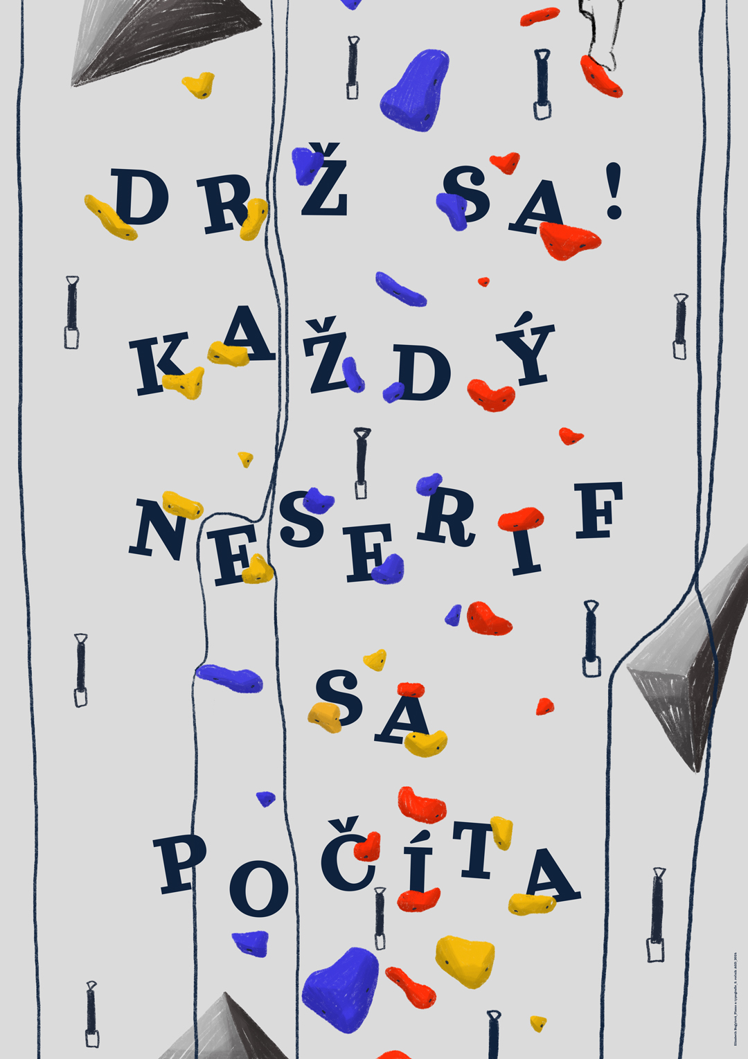
Hold on!
70 x 100 cm
digital drawing, laser print
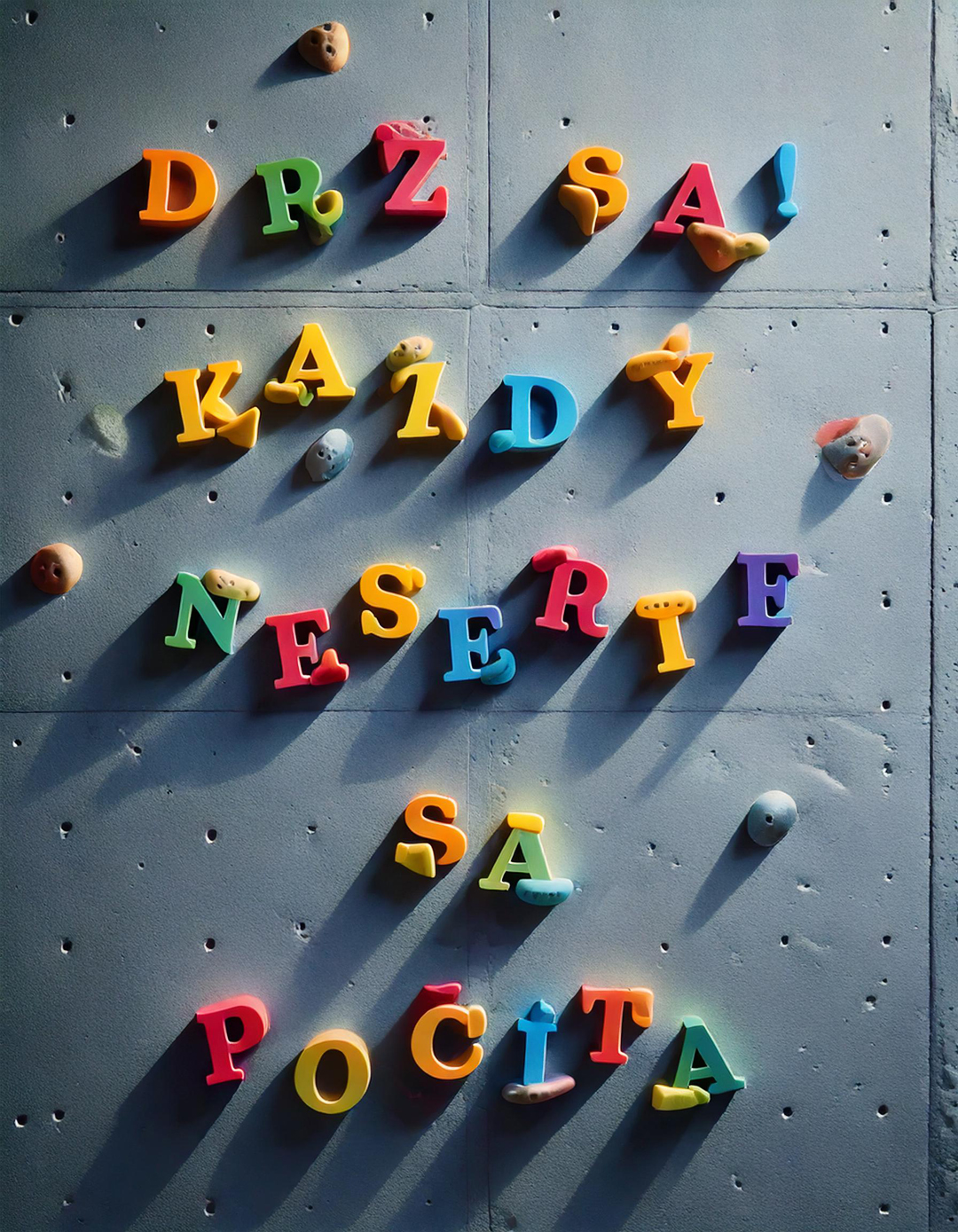
The artwork is a creative fusion of typography and climbing culture. The text is written in a serif typeface, but the serifs are replaced with colorful climbing holds, turning the typography into a playful visual metaphor. The arrangement of letters among the holds creates the impression of climbing a wall, where each text element plays a crucial role—just like every hold in conquering a real climbing route. The vibrant holds in shades of yellow, blue, and red add dynamism and energy, while the phrase "Every non-serif counts" highlights the importance of details in both design and climbing.

Image to text description:
A poster with the words "DRZA svojá NS boils sa pocíta" written in colorful letters on a white background, surrounded by various tools such as pliers and hammers. The text is arranged to form an abstract pattern that conveys different shapes of tools, while also being legible for reading. This design uses bold typography and contrasting colors to draw attention to its message.
A poster with the words "DRZ Marker Unsqueezed Pocita" written in colorful letters, featuring climbing tools and multicolored pebbles on a white background. The design is minimalistic and simple, using vector graphics to highlight each word clearly against the gray backdrop. There's an emphasis on simplicity of form and color, creating a modern aesthetic that emphasizes clarity over complexity.
Poster with the text "DRZLEAP LEFT". The poster is made of simple shapes and has various tools, such as pliers, crowbar, or sledgehammer. It also features colorful pills scattered around in different sizes. All elements have thin outlines to emphasize their shape.
A poster with the words "PERSEVERE" written in different colors and bold letters, featuring climbing equipment such as carabiners and ropes. The background is white, with colorful hand-drawn shapes of rocks and sky above, in the style of minimalist style, flat illustration, vector art, simple lines, grey background, no shadows, no color on edges.
LLM description:
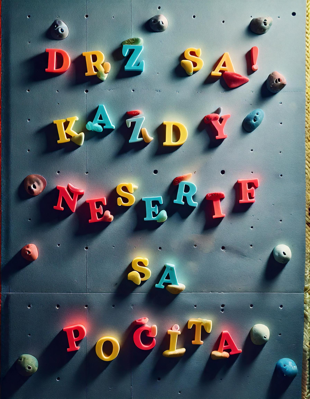
"This image combines the themes of a climbing wall and typographic expression, using a playful connection between visual and textual elements. The text "DRŽ SA! KAŽDÝ NESERIF SA POČÍTA" is arranged among colorful climbing holds and ropes, referencing the metaphor of climbing as an effort and the struggle to hold on. Typographically, both sans-serif and serif fonts are used, with the contrast between these two styles emphasizing the word "neserif," which carries both typographic and motivational significance. The serif typeface represents precision and tradition, while the use of the word "neserif" can be interpreted as a call for greater informality or boldness. Overall, the image is playful and engaging, with a well-chosen contrast of colors and type styles. The clear and prominent serifs give the text structure and emphasis. The composition enhances the visual dynamism of the image while also reinforcing both its content and message." ChatGPT 4.0, OpenAI
At first, I was skeptical about working with artificial intelligence. However, after my initial experiences, I realized that the mistakes and inaccuracies AI generates in its designs can be surprisingly inspiring. As a tool to support the creative process, AI has proven to be highly useful—it helps broaden perspectives on design and brings unexpected ideas. Despite this, I have found that AI-generated results cannot function as a final output on their own. Design always requires careful refinement and human intervention to achieve a professional level and aesthetic harmony. This experience has shown me that AI can be a powerful ally in the creative process, but not a replacement for the creative artist.
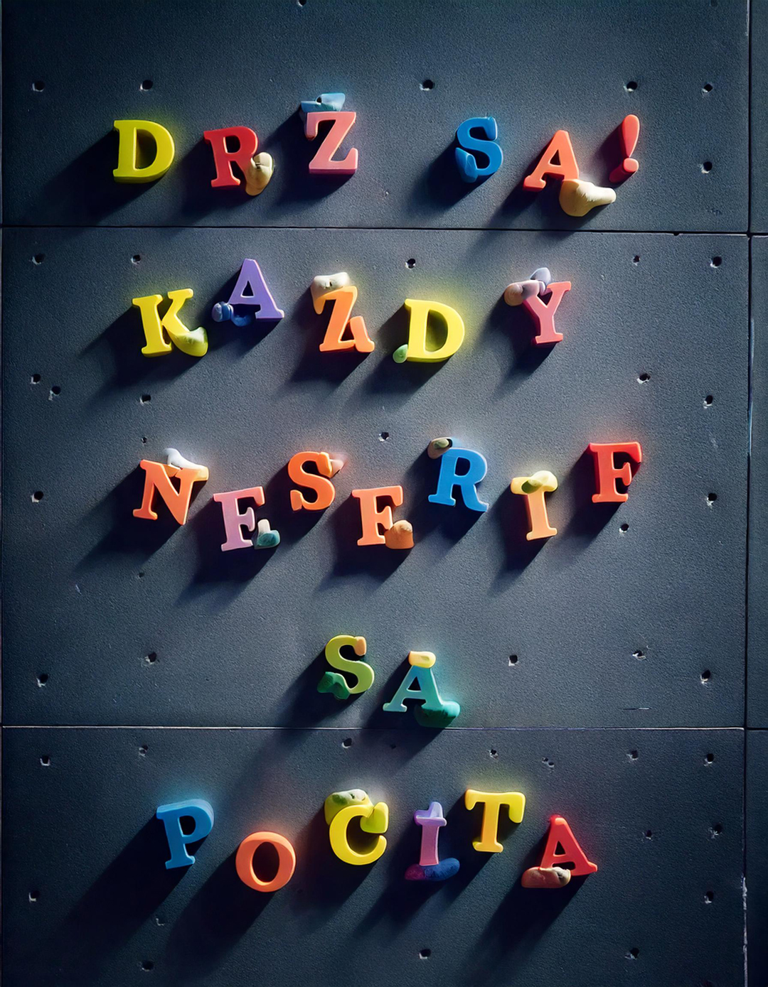
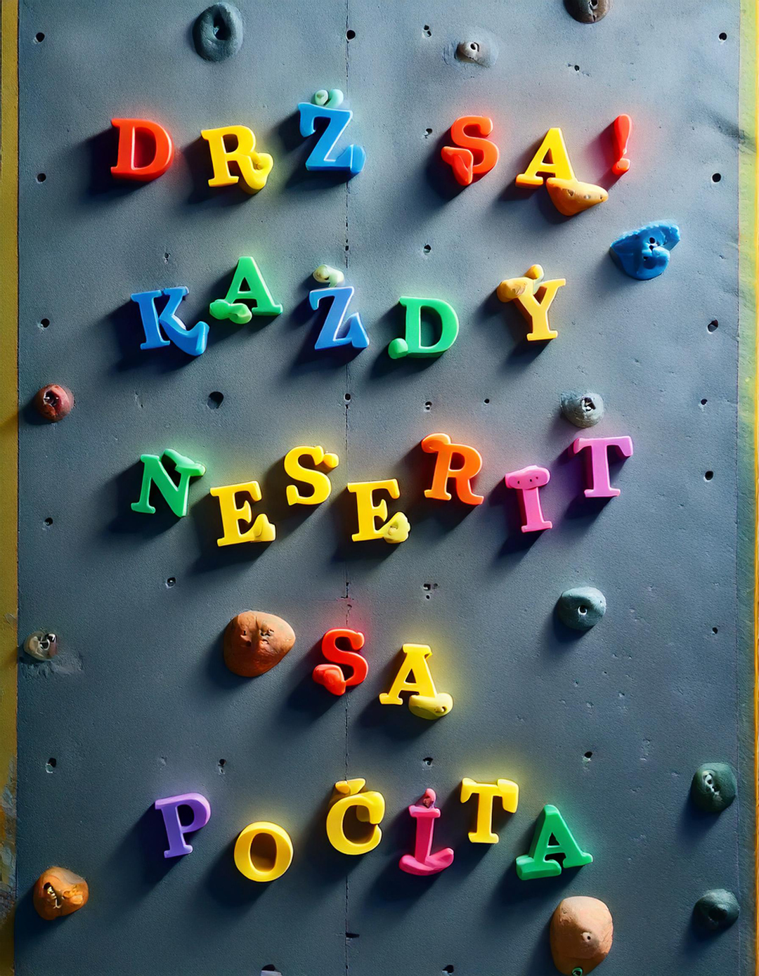
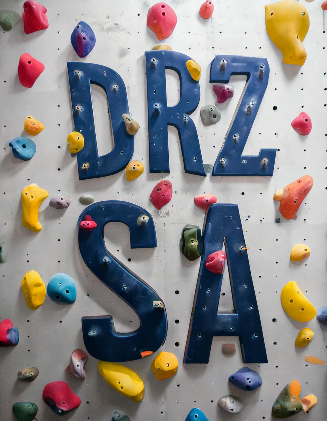
Variations:
Project 2
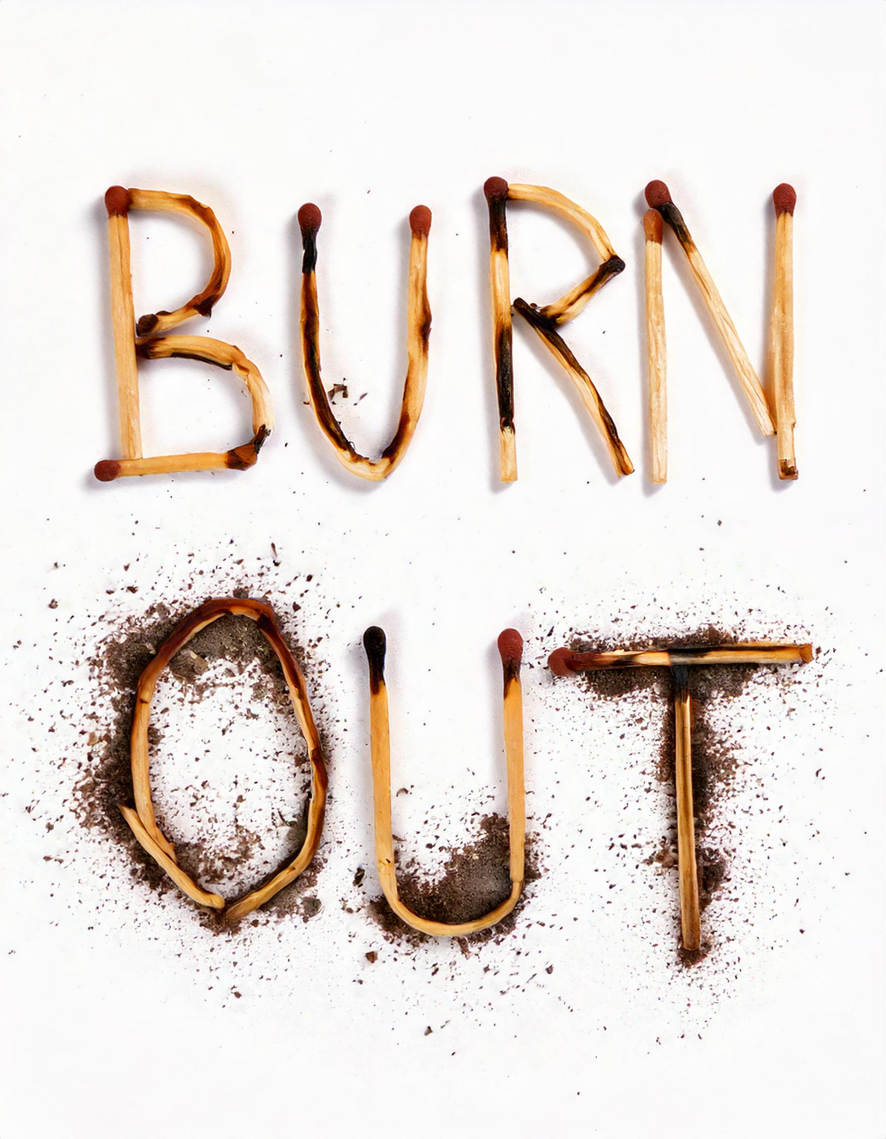
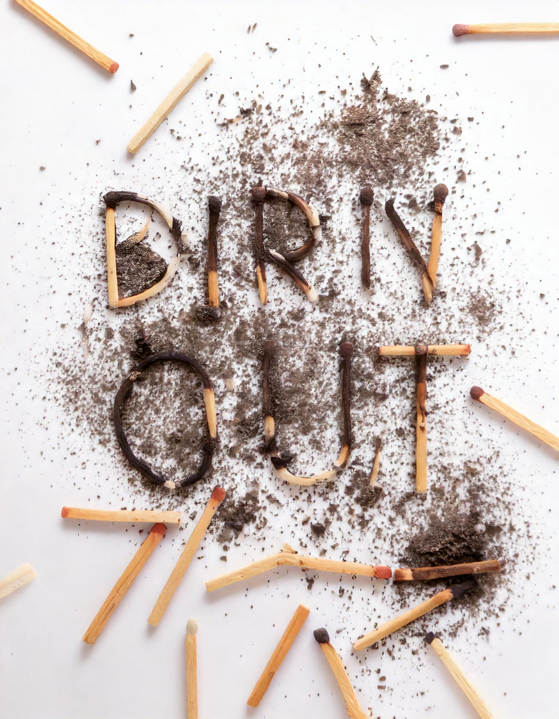
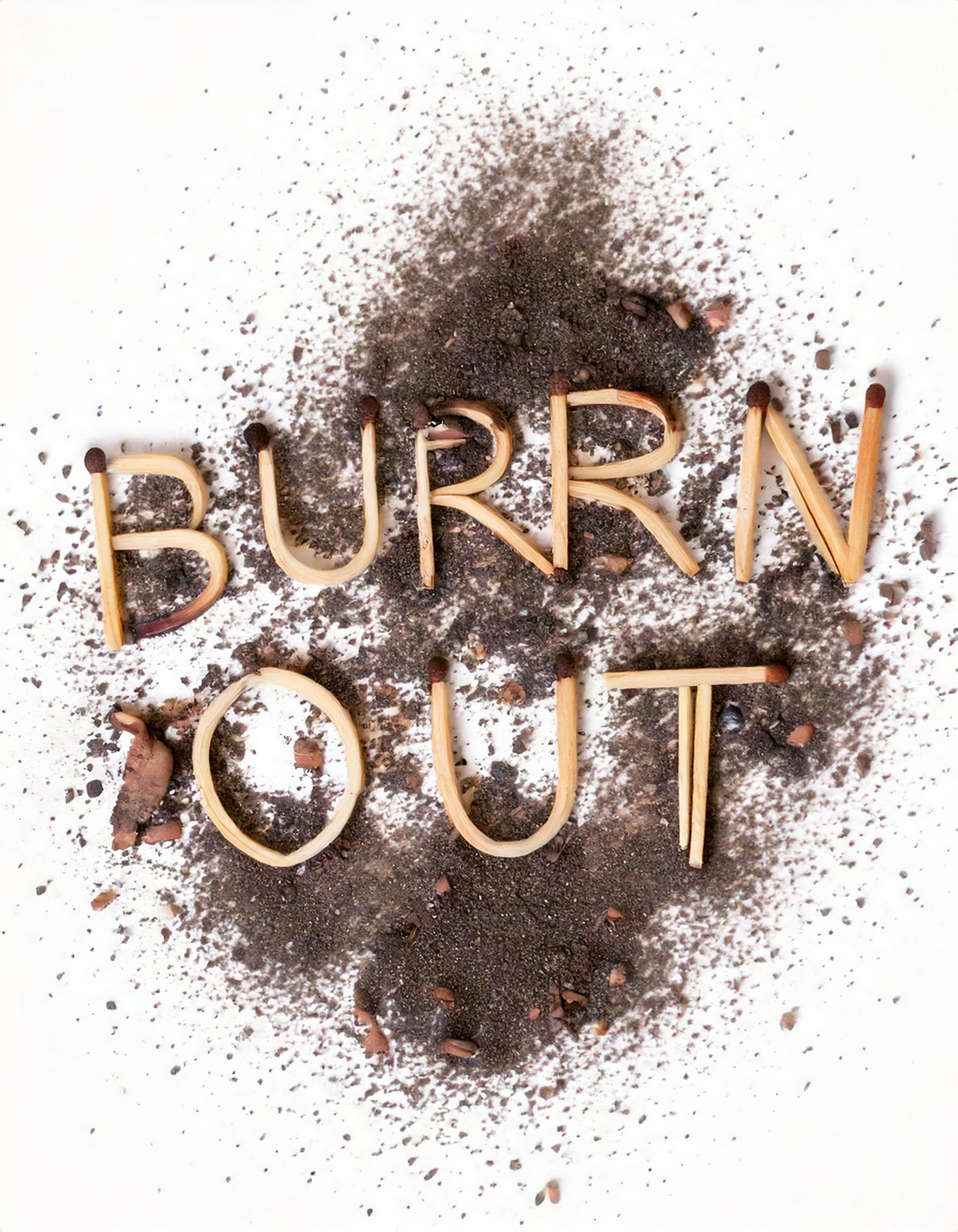
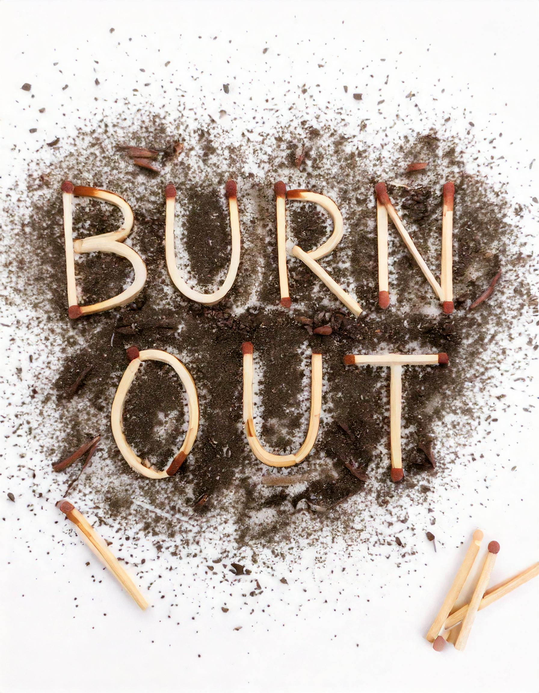
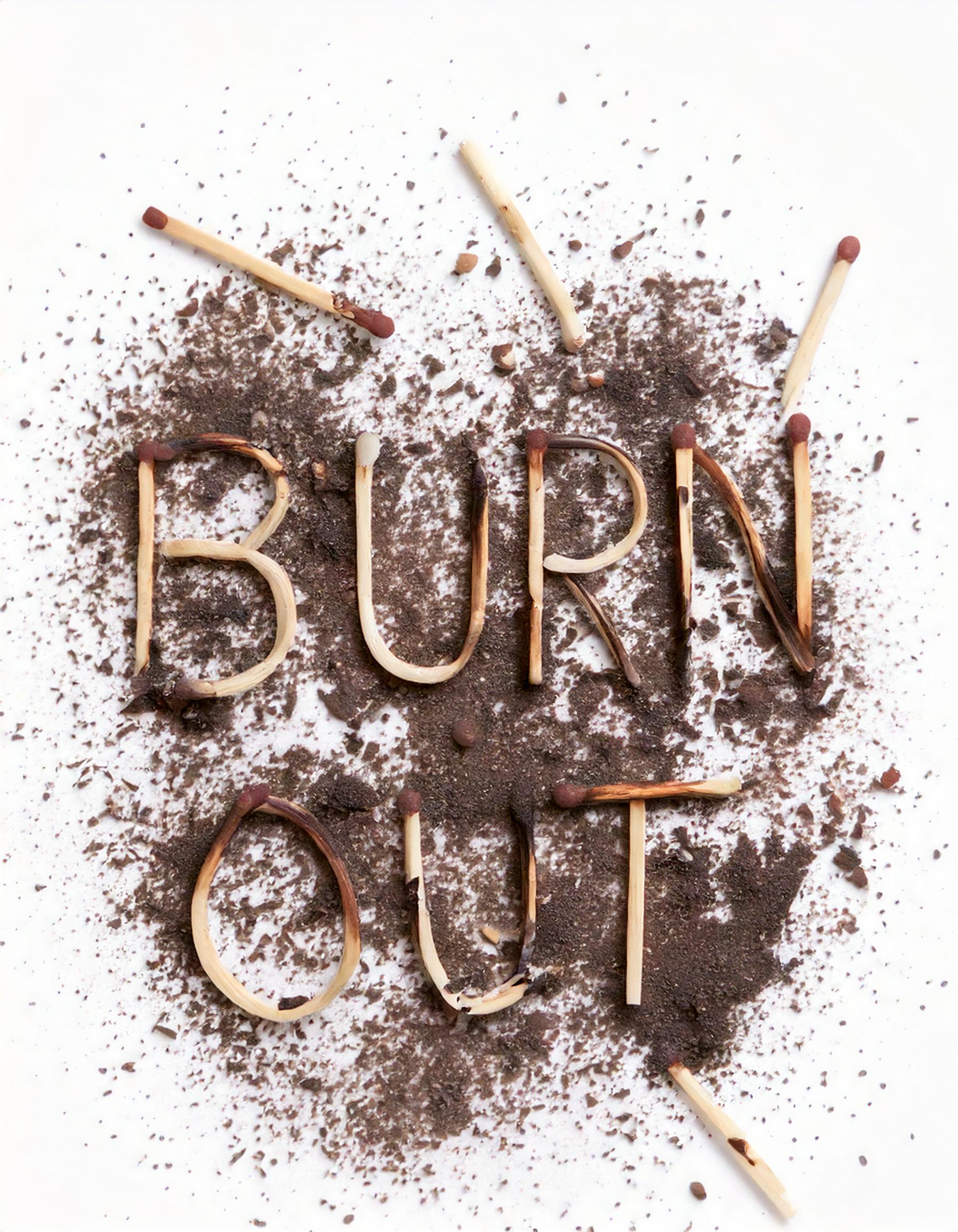
Blazing Non-Serifs
70 x 100 cm
photo manipulation, laser print
The artwork is a conceptual play on typography and symbolism, combining visual elements with a strong ideological message. It contrasts classic serif typography with the modern idea of "non-serifs"—a rebellion against established norms and traditions.
Matches, shown in various states (intact, lit, burned), symbolize the creative process as well as the destruction of serifs. Their placement within the text creates the impression that fire physically consumes the typeface. The minimalist white space around the composition enhances the dramatic contrast between the text and the matches, allowing the viewer to fully engage with both the symbolism and aesthetics.
Image to text description:
A simple typographic poster with the word "Harvest Whisper Beginner's Mind in the style of VanderWise" in cursive, white background, minimalistic typography, thin letters, white and black color palette, clean design, elegant font style, balanced composition, subtle shadow effect on text for depth, minimalist art direction, vector illustration in the style of Sagi Haviv, no realistic photo detail shading, high resolution, high definition.
"Zhavne Fertility" logo, font design, vector text with white background, simple minimalistic, black letters on the top of clean and minimal wallpaper, simple minimalist, white space around all sides of the photo, text centered in the middle of the frame, text only, no other elements or graphics.
A simple typographic poster design with the word "Jaime Diseño". The letters of "Jaime" in black on a white background. Minimalist, modern typography. Simple and clean. Aesthetically pleasing and professional.
Logo, minimalist style shape, text "Zdizhavelnysteriy", text made of sticks and wood, solid background white color.
LLM description:
"This minimalist visual with the text "Blazing Non-Serifs" utilizes the contrast between the simplicity of white space and the dramatic rendering of text and objects. Typography plays a key role here—the chosen serif font emphasizes the reference to serifs, while the word "non-serifs" acts as both a wordplay and a commentary on the debate between traditional (serif) and modern (sans-serif) styles. The symbolism of matches, some burning and others extinguished, reinforces the metaphor of a "hot topic" or an intense discussion about typography. Smoke and charred traces add dynamism and a sense of movement, balancing the static nature of the text. Overall, the poster is clean and focused on its message, with its simplicity and composition making an immediate visual impact." ChatGPT 4.0, OpenAI
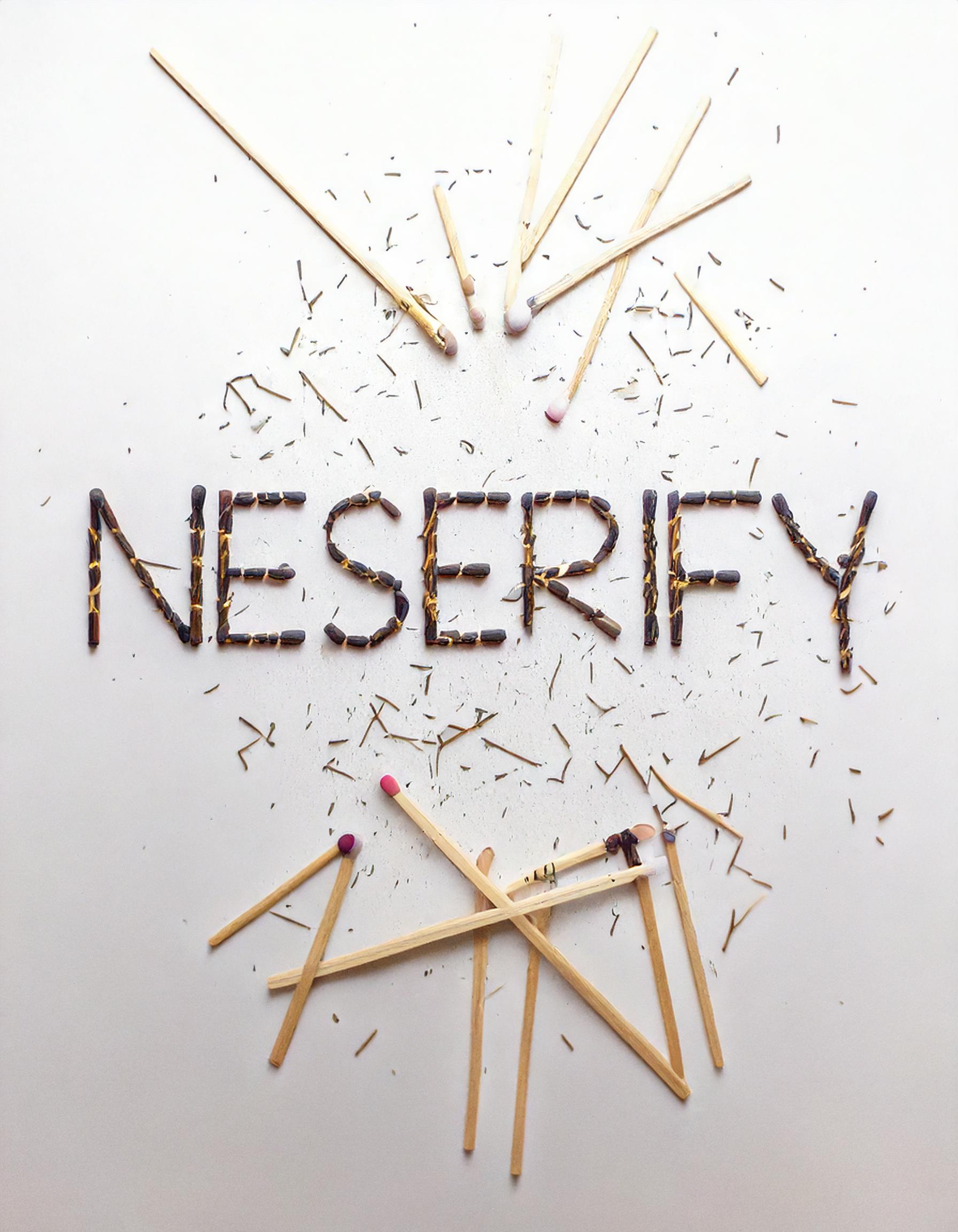
Variations:

Galerie G18 ve Zlíně
Gallery of the Faculty of Multimedia Communications,
Tomas Bata University in Zlín
Štefánikova 5670, Zlín
Czech republic