Klaudia Hegyiová

Let’s Build Serifs
Hand-drawn on a tablet, A3 size, scanned
Concept adjusted digitally in pixels
Font used: Hoefler Text
Software: Procreate, Adobe Illustrator
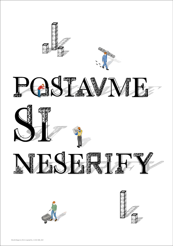
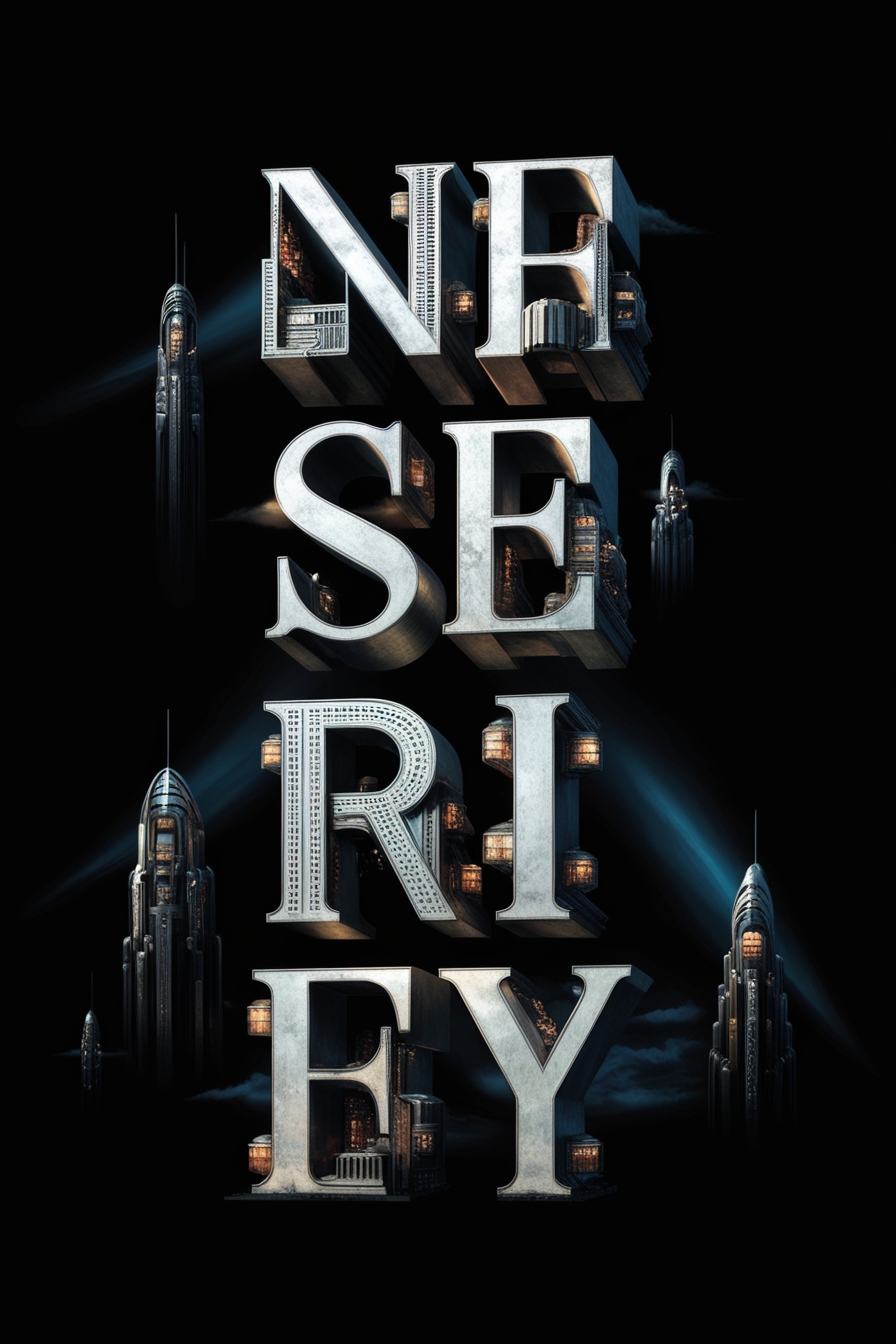
The artwork “Let’s Build Serifs” playfully illustrates the creation and development of essential typographic elements, such as serifs. The large typography, serving as the poster’s focal point, resembles massive architectural structures, with some parts still under construction.
This concept presents typography as an evolving form, something that can always be reworked and reconstructed, even if it is fundamentally "perfect" in its original structure. Creativity knows no bounds, and anyone can become a builder, assembling their design piece by piece.
The scaffolding depicted in the poster symbolizes the process and journey, which are the most crucial aspects of creating something monumental. The workers moving around the letters perform their assigned tasks, adding color and structure, emphasizing that every creation has its designer.

Image to text description:
The poster features the text " Postave si nesery ", in bold letters, and below is an illustration of workers carrying building blocks. The background color should be white to highlight each element.
A poster of the text " Postavame nesery ". The word is written in big letters, simple font and bold lettering. There's an illustration on it with small people working at construction site. It has minimalistic design and beige background. Simple shapes, simple lines. by Jean Jullien
A poster with the text " postave stиндere lắp Barricade". The word 'postaver' is written in large letters and uses simple typography, while ‘st.flat’ is depicted as tiny people carrying steel beams on their shoulders. This design emphasizes that these characters carry heavy objects to build something new. by John Holcroft for A4 format, minimalistic style, white background,
A poster of the word "postame society" written in large letters, with small people building it up and down on each letter. Minimalist style. The background is white. A graphic design by Moebius, using only black, beige, grey colors. High resolution vector graphics. In an illustrative style. In flat illustration. Isolated on solid light color background. Clean lines. Flat art style. The title says " nomev fonLevelrrne Trades".
LLM description:
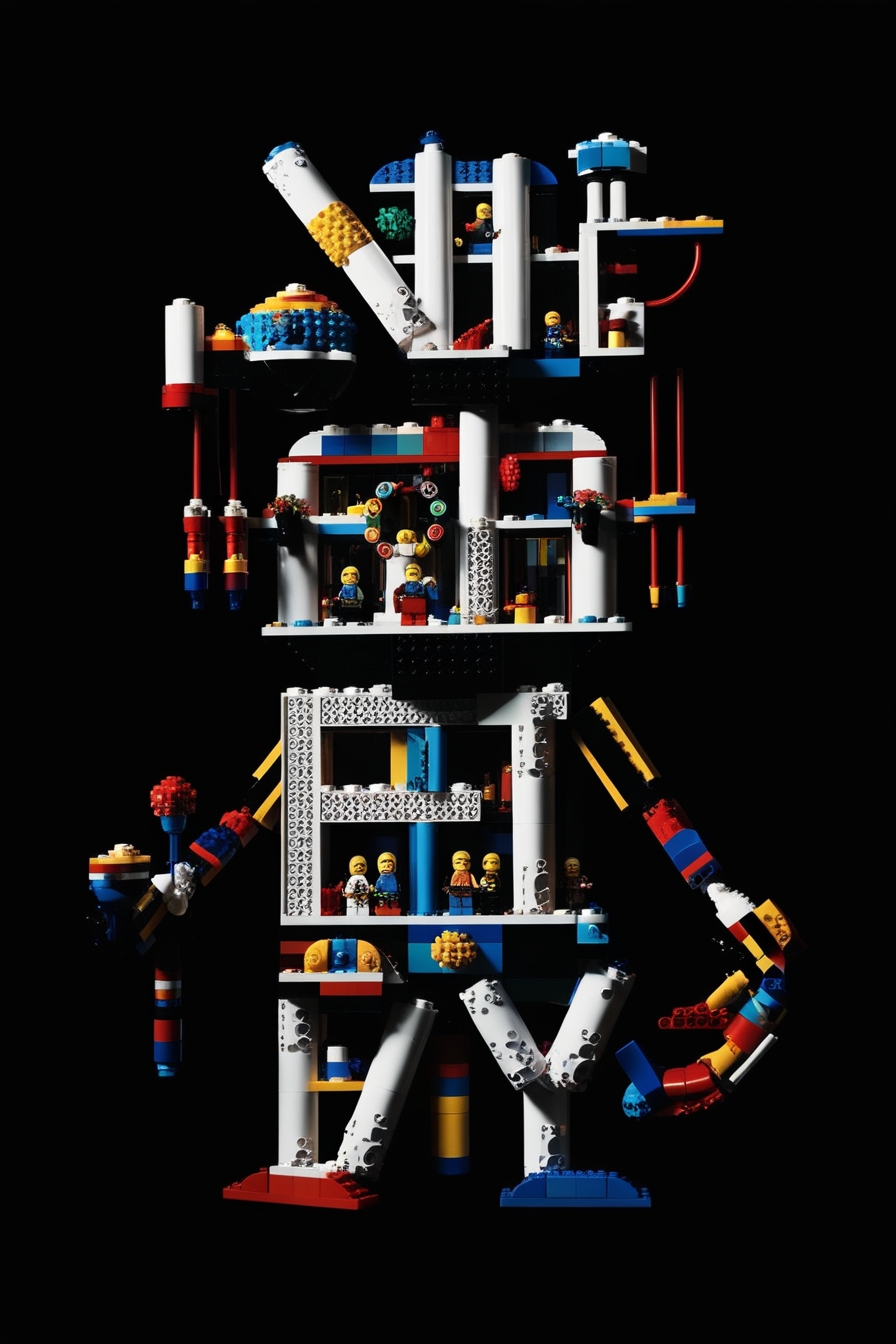
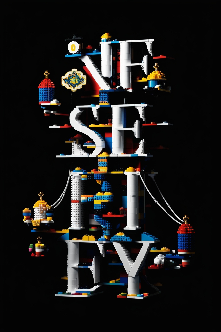
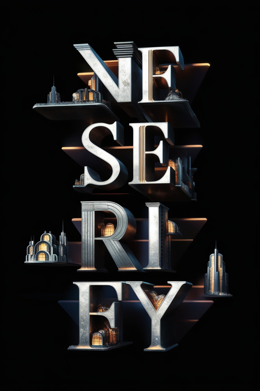
"This image features the inscription "Let’s Build Non-Serifs" and an original concept that blends typography and illustration. The text is designed as a 3D structure, resembling a construction site, visually evoking the process of building.Each letter appears to be assembled from structural elements or scaffolding, reinforcing the idea of creation and construction. Small illustrated figures carrying materials, working on the structure, or using tools add dynamism and humor to the design.The integration of labor and typography serves as a metaphor for the process of developing typographic styles, particularly serif fonts. The term "non-serifs" can be interpreted as a reference to the absence of serifs or a playful take on the typographic design process.The white background highlights the individual elements, ensuring a clean composition. Overall, the design feels creative and interactive, emphasizing the connection between construction and typography. This approach makes the inscription appealing not only to typography experts but also to a broader audience interested in design." ChatGPT 4.0, OpenAI
The creation of this poster feels like blurring the lines between traditional and modern approaches. The letters, with their prominent serifs built from scaffolding, seem to carry the nostalgia of old craftsmanship, while the design process involving artificial intelligence opened doors to unpredictable future possibilities.The generative models tasked with reinterpreting the original design appeared to walk the fine line between past and future—reshaping classic forms into something new. Yet, the results often balanced between chaotic abstraction and mechanical imitation. At times, it felt as if AI was merely repeating endless variations of the original concept, while at other moments, it surprised with unexpected creativity, as if in its vision, the scaffolding transformed into a dynamic architectural element.I thoroughly enjoyed creating with artificial intelligence.
I see AI not as competition but as a powerful tool that graphic designers can integrate into their workflow. It can elevate our ideas to entirely new levels and expand creative possibilities, making it a valuable assistant in any artistic process.
Generated variations:

Galerie G18 ve Zlíně
Gallery of the Faculty of Multimedia Communications,
Tomas Bata University in Zlín
Štefánikova 5670, Zlín
Czech republic