Lucia Silberová

Italian Shapes
Digital sketch on tablet, A3 size
Concept created as a vector in PC
Font used: Playfair Display Regular
Software: Adobe Illustrator
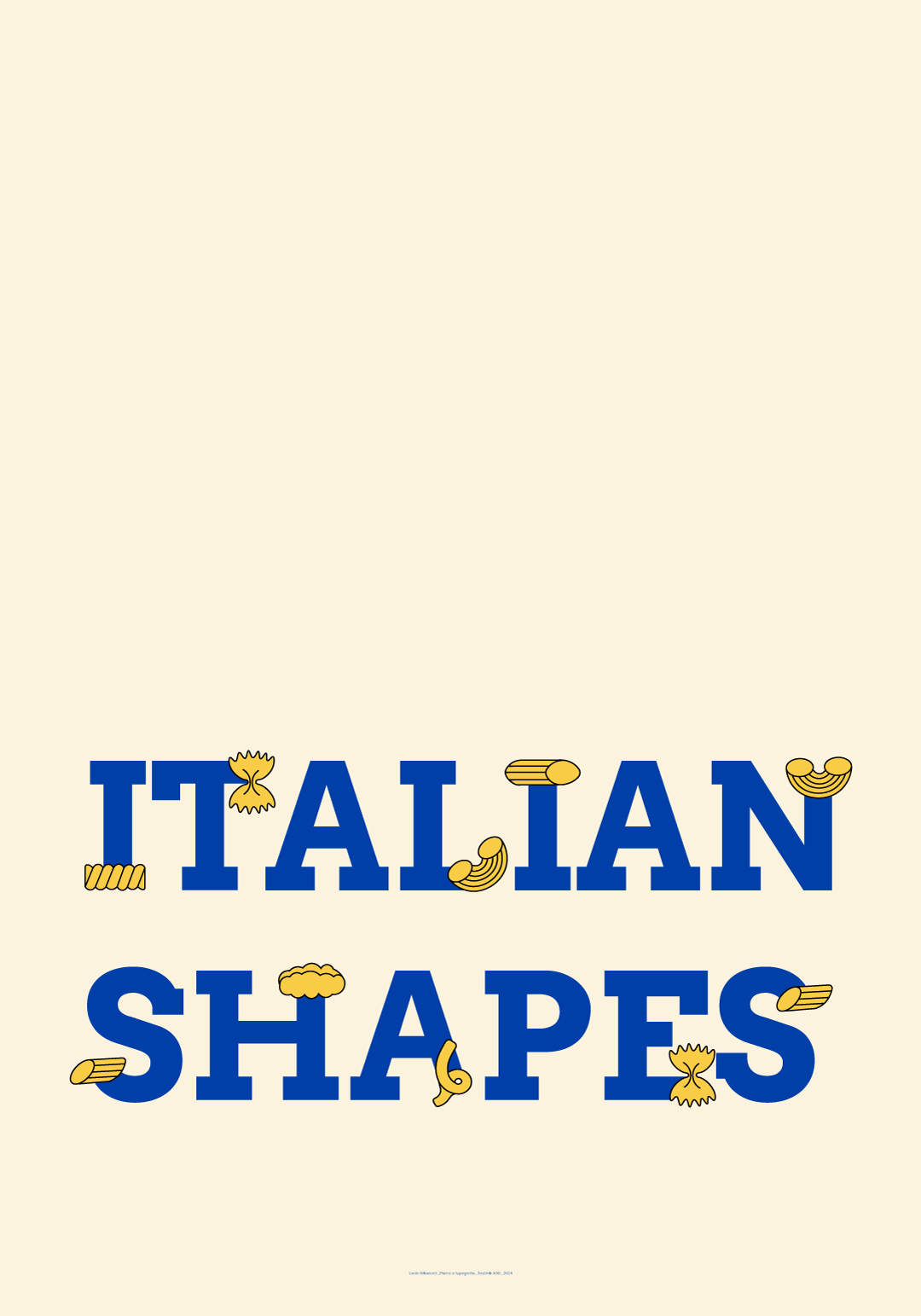
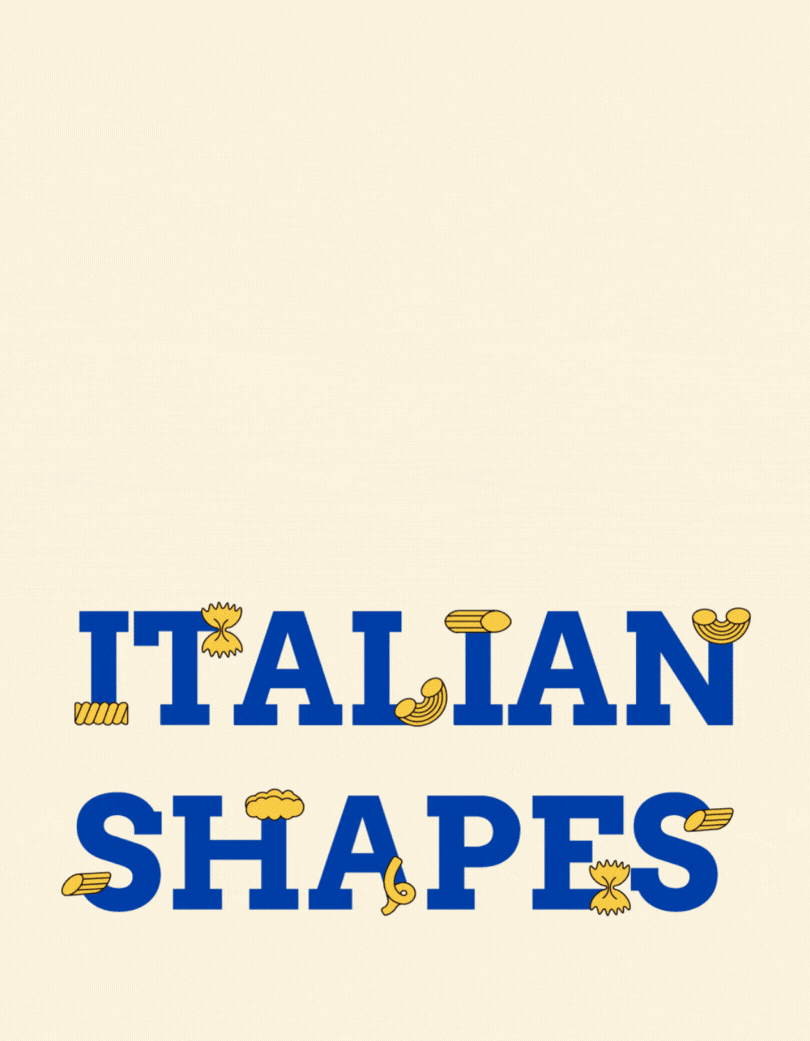
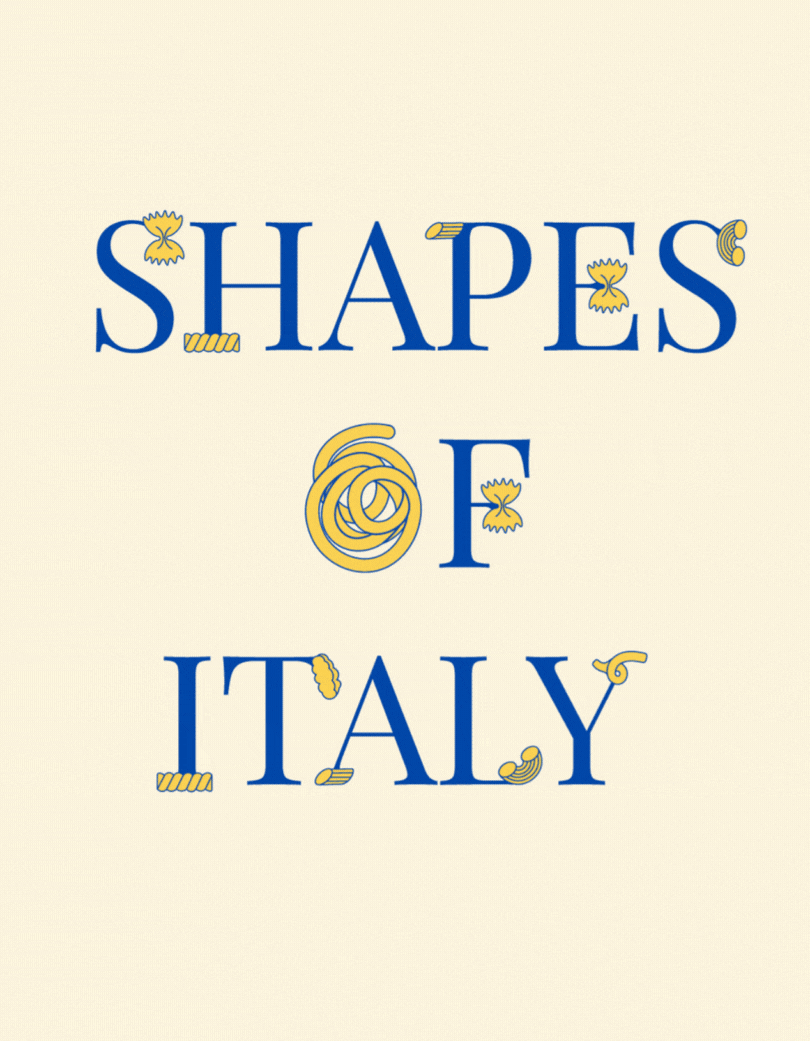
The poster titled “Italian Shapes” playfully combines typography with gastronomy. In the design process, a serif typeface was used, with the serifs of the letters replaced by different types of pasta, mimicking the original placement of the serifs. The poster highlights the diversity and aesthetics of pasta shapes, which are an iconic symbol of Italy.
I applied complementary color schemes of yellow and blue. Yellow evokes the color of pasta and the Italian sun, while blue adds contrast, reminiscent of the Mediterranean Sea, and brings an element of elegance. This combination creates a balanced composition that emphasizes the connection between tradition and a bold visual statement.
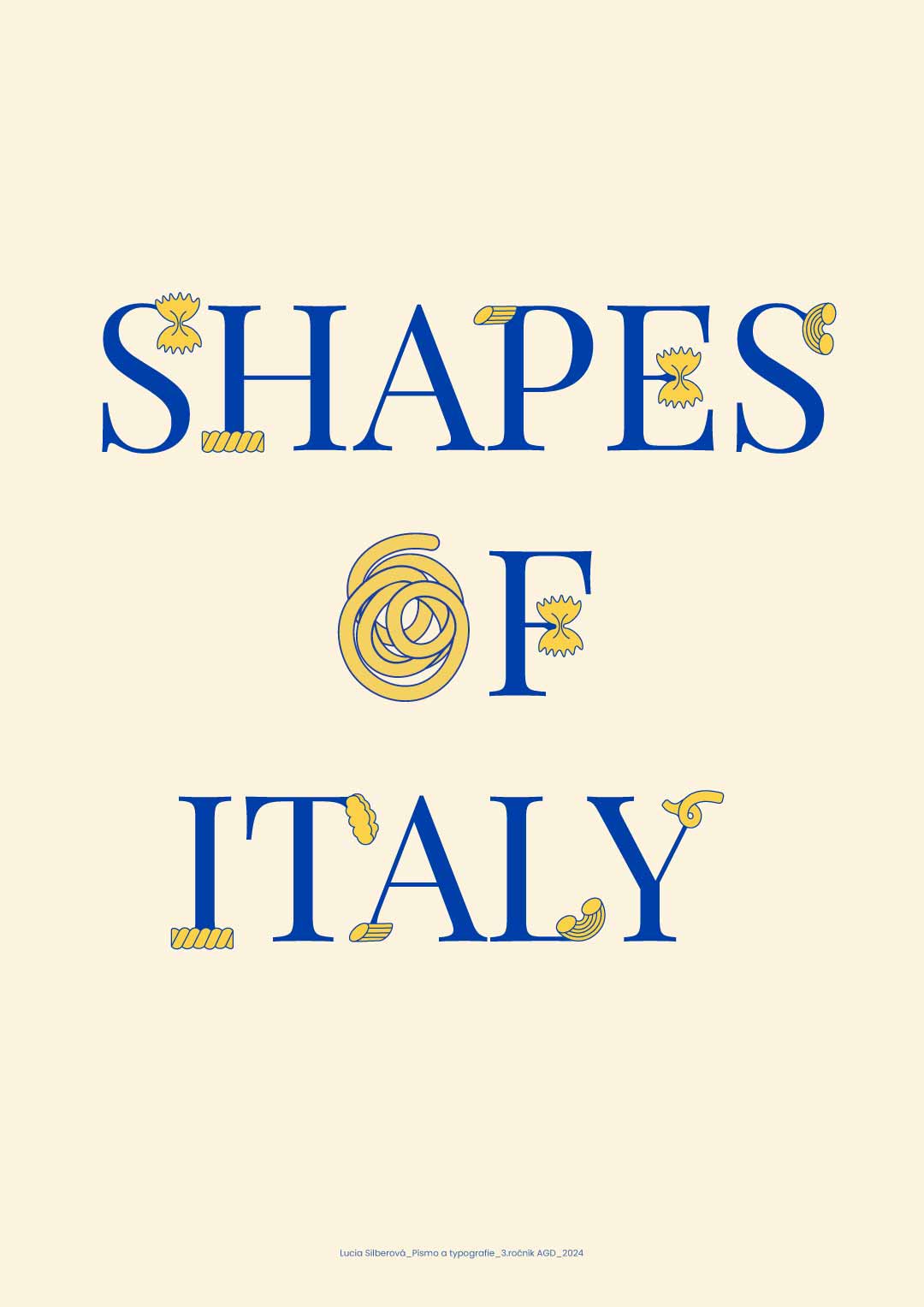

Image to text description:
"SHAPES OF ITALY", modern lettering, blue and yellow, minimalistic design with pasta-shaped letters, text "Prepare to explore the shapes of Italy through its most famous pasta! Uncover one colorful shape at a time using the illustrations on the following pages, and give each shaped variety an Italian name. It's your last fun piece for our book that will help you master all elements of the Italian language in no time!
A simple poster with the text "SHAPES OF ITALY" in bold blue letters, the lettering is set against an elegant cream background, featuring detailed yellow pasta shapes forming each of the three S's and I's, creating intricate patterns that add visual interest to the design. The overall composition captures the essence of Italian cuisine through its simplicity and minimalistic style, creating a visually appealing piece for your kitchen wall.
A modern, flat design poster with the words "SHAPES OF ITALY" in bold blue letters and an illustration of pasta shapes forming Italy on a light yellow background. The overall color scheme is soft pastel with accents of royal blue. It's simple yet elegant, suitable for packaging or branding materials. A simple minimalist style with clean lines, creating an iconic look that stands out against traditional Italian food designs, in the style of John Holcroft for Minimalism meets Art Deco, featuring geometric patterns and stylized typography.
"SHAPES OF ITALY", a modern minimalist poster, features blue and yellow text on a cream background, with pasta shapes in the design of Italy.
LLM description:
"This poster, titled “Shapes of Italy / Italian Shapes”, combines typography with visual symbols of Italian culture, specifically the shapes of pasta, which are integrated into the individual letters of the serif typeface. The use of a serif font with bold serifs emphasizes the traditional character and elegance, aligning with Italy's cultural heritage. At the same time, some letters are enhanced with illustrations of pasta shapes such as farfalle, fusilli, and penne, creating a playful contrast between the structured typography and the organic shapes. The color palette of blue and gold evokes the national colors of Italy, enhancing the visual appeal of the poster. Overall, this is a conceptual design that demonstrates how typography can be connected with cultural elements and transformed into a functional and aesthetic visual message." ChatGPT 4.0, OpenAI

Project 2
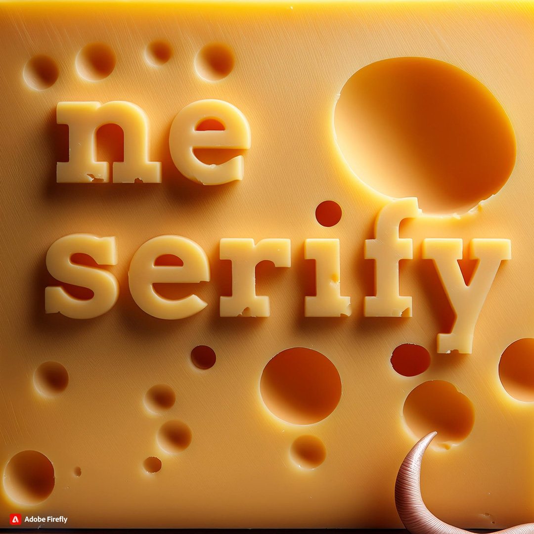
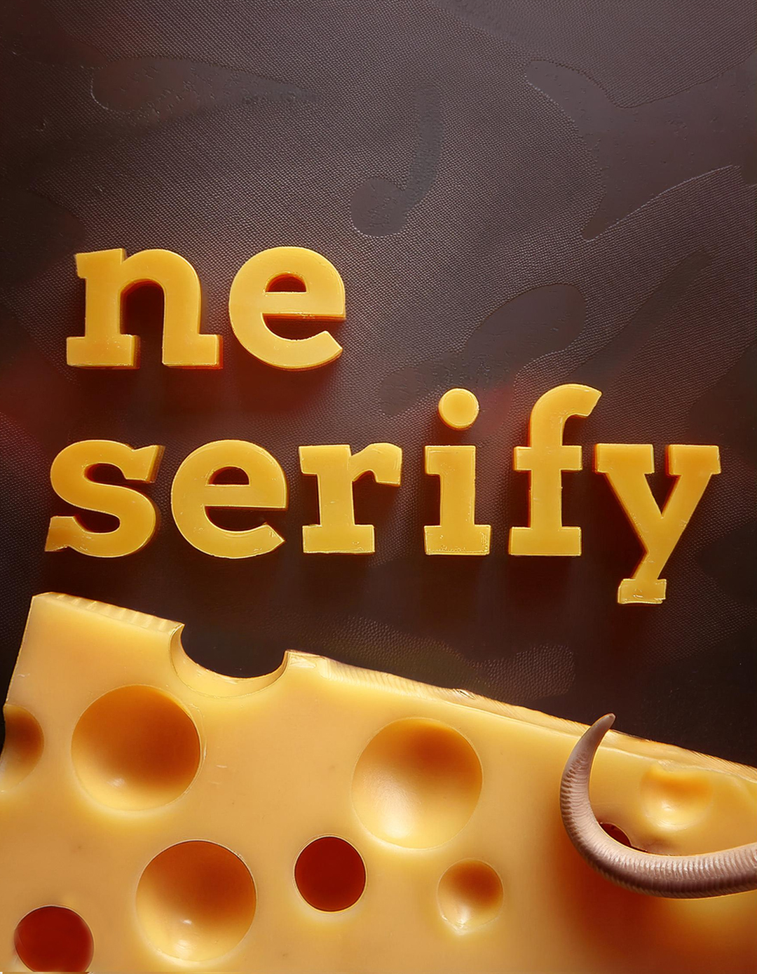
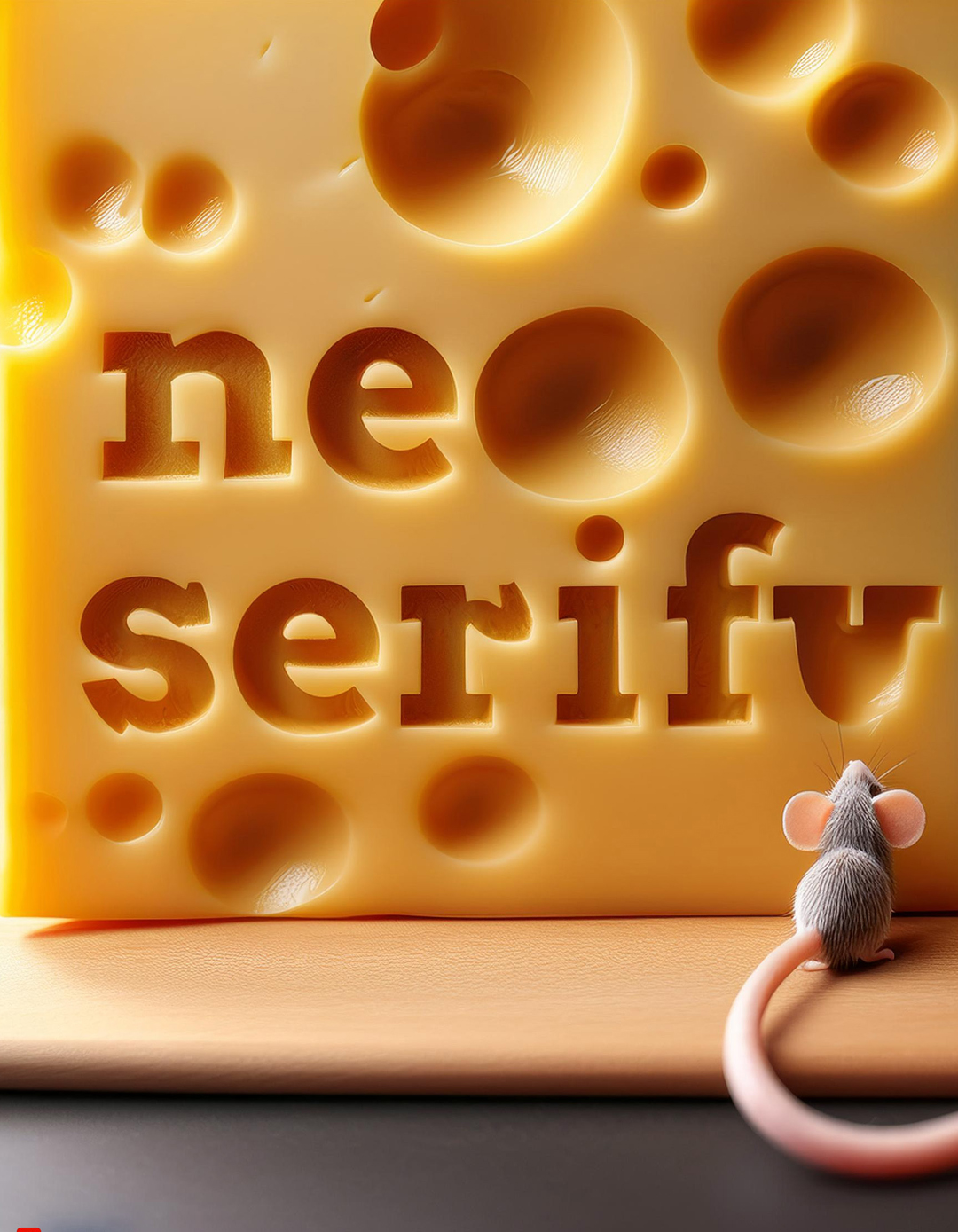
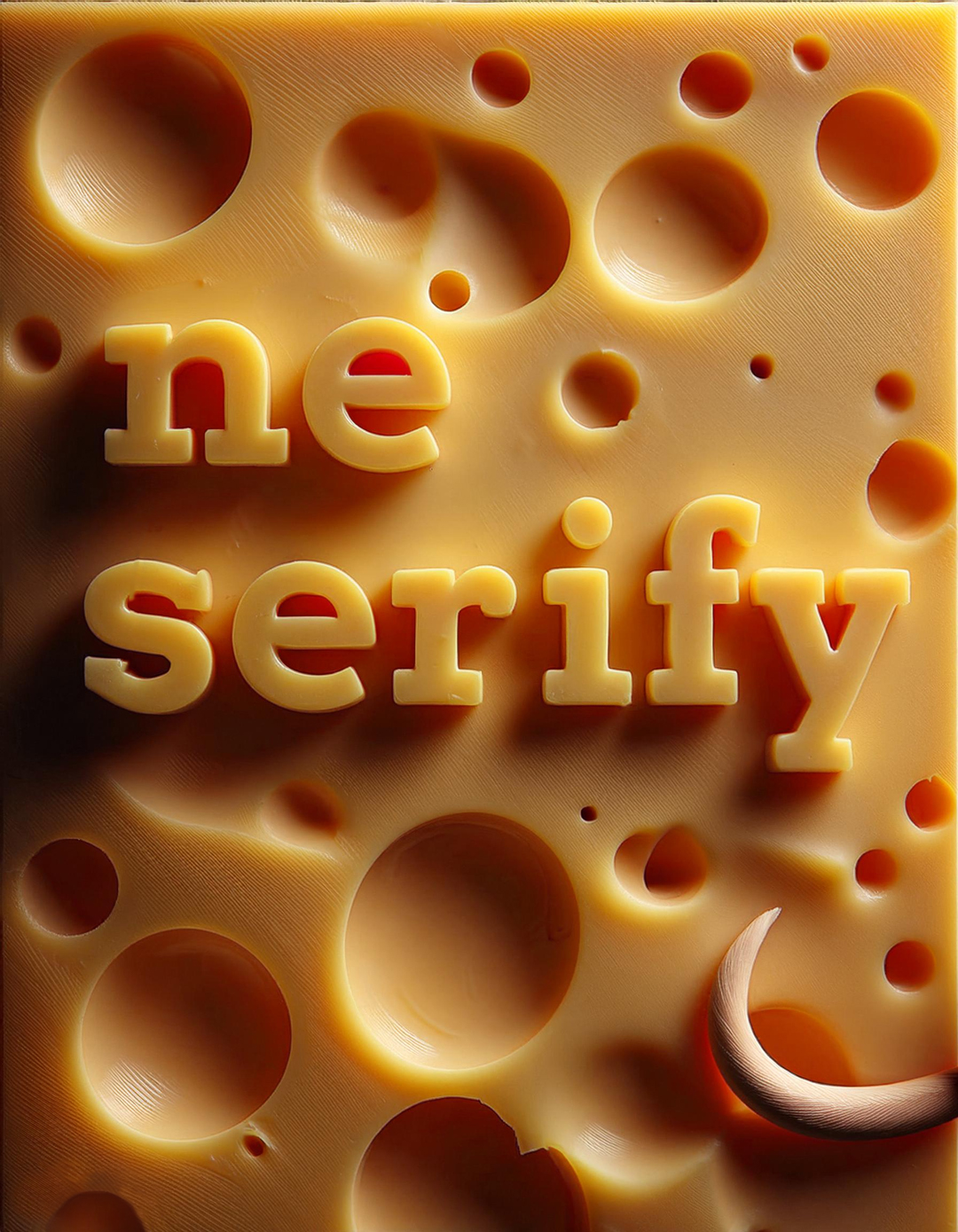
Neserify - Cheesy
Digital sketch on tablet, A3 size
Concept created as a vector in PC
Font used: Playfair Display Regular
Software: Adobe Illustrator
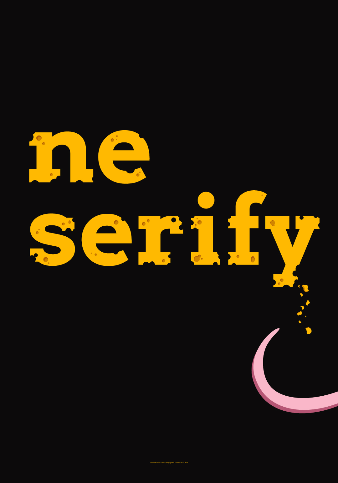
The poster titled "Neserify - Cheesy" playfully replaces traditional serifs with cheese holes. The concept brings the typeface to life and connects it with a story. The pink element at the bottom represents a mouse tail, linking the entire design to the mouse as a symbolic consumer of cheese. The final poster is the result of the interaction between the mouse and the cheese.
The black and yellow color contrast ensures visual interest, while also emphasizing the individual elements. The poster combines playfulness, creativity, and simplicity, while inviting the viewer to explore the hidden details.
Image to text description:
The word "new" is written in yellow, the letter E with pink curved edges and N in large letters on a black background. The text reads "surly".
One stretched scene in the style of yellow and pink, bold font on black background, cartoon style, simple design, minimalistic
"The Spirit" written in yellow and pink on a black background, yellow text with a white outline, simple vector design, simple typography, yellow text only, in the style of Cy Twombly.
Whimsical Reverie" in yellow, text on black background, vector style, cartoonish, cartoon yellow and pink crescent moon on the right side of the lettering, simple, minimalistic, no shadows, flat design, white letters, black ground color, simple font
LLM description:
"This poster plays with the wordplay in the title "ne serify", which is visually emphasized using a cheese motif. The text, in bold sans-serif typography, is perforated with holes resembling the texture of Emmental cheese. At the bottom of the poster, a pink detail (likely a mouse tail) creates the impression that the text has been “nibbled”, or that there’s a playful interaction with the cheese. The color scheme—black background and contrasting yellow text—enhances readability and grabs attention. This playful concept turns typography into a visual joke, serving as an ironic commentary on the debate between serif and sans-serif fonts. The design is both humorous and original, offering a unique approach to promoting typography." ChatGPT 4.0, OpenAI
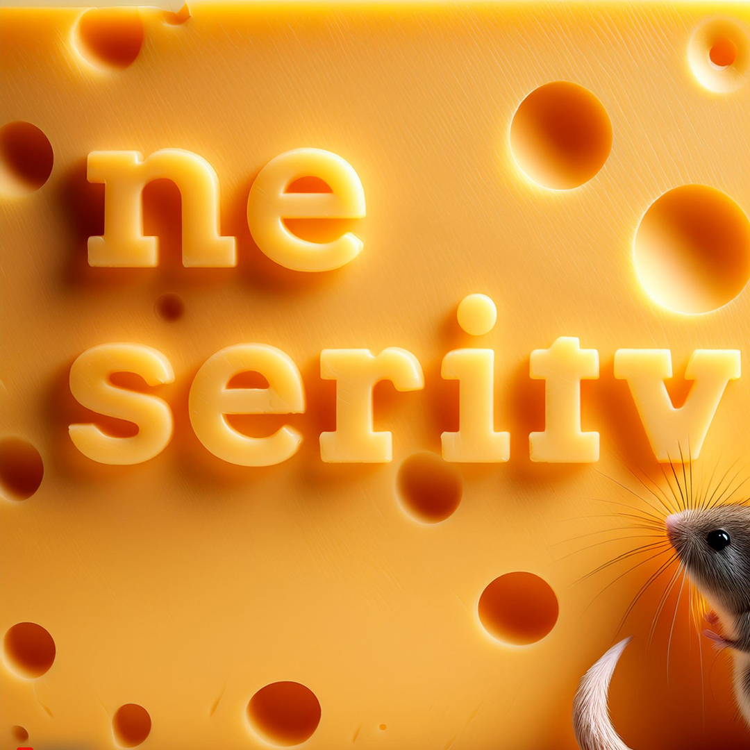
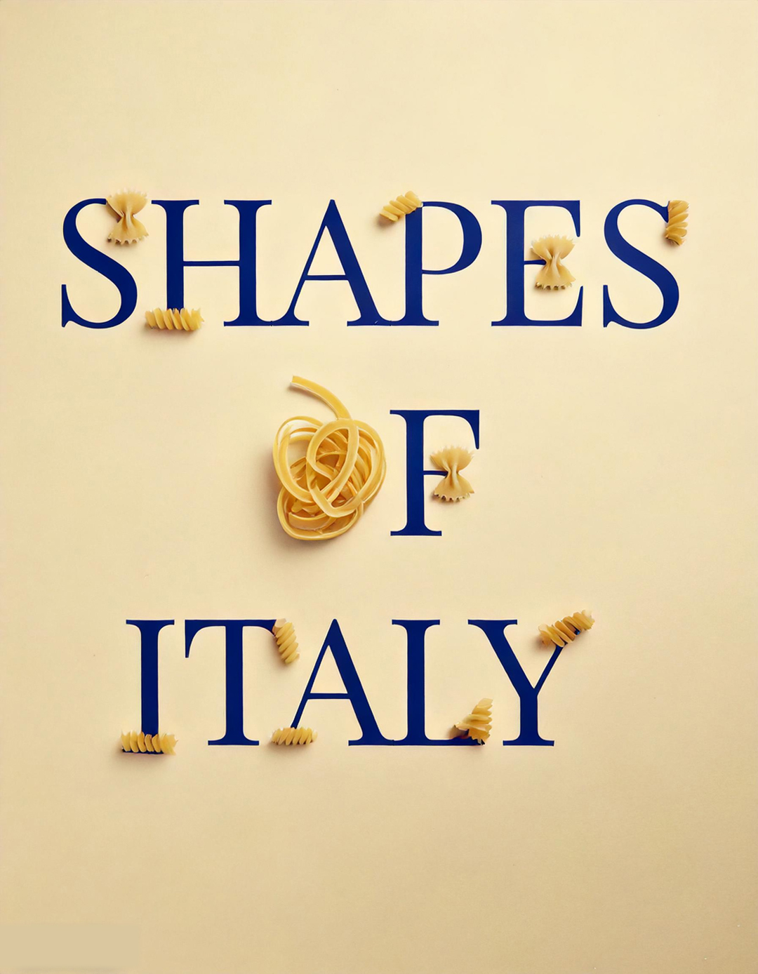
Creating posters with the help of artificial intelligence has completely shifted my perception of poster design in a whole new direction. The results exceeded my expectations because I had not had much opportunity to work with AI to this extent before. Its tools offer us the chance to push our work in different directions.
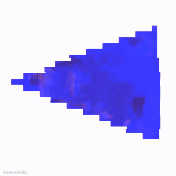
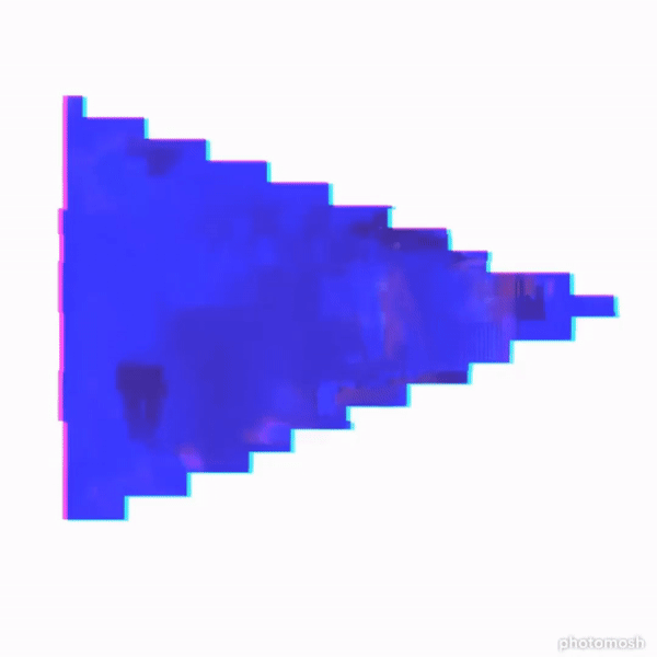
When creating the generated visual, I worked with the template of my traditional poster. The prompt was expanded with a description of my vision for the poster, specifically one featuring pasta, where I preferred a realistic depiction of the pasta, creating a contrast with my vector illustration. I believe that generated models, combined with my own input, can serve as an excellent tool to simplify work across various industries.

Galerie G18 ve Zlíně
Gallery of the Faculty of Multimedia Communications,
Tomas Bata University in Zlín
Štefánikova 5670, Zlín
Czech republic