Nikola Čermáková


Lost and Found
Digital drawing, laser print
Font modification, digital drawing, post-processing on PC
Used fonts: Impact, Helvetica
Software: Procreate, Photoshop, Illustrator
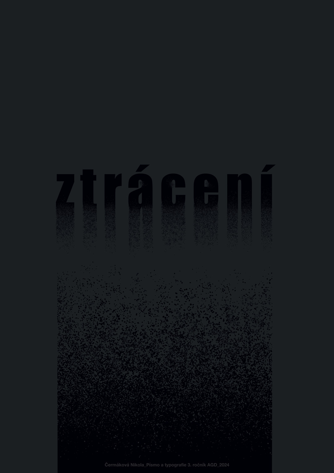
The artwork "Lost and Found" consists of two posters that contrast thematically and visually.
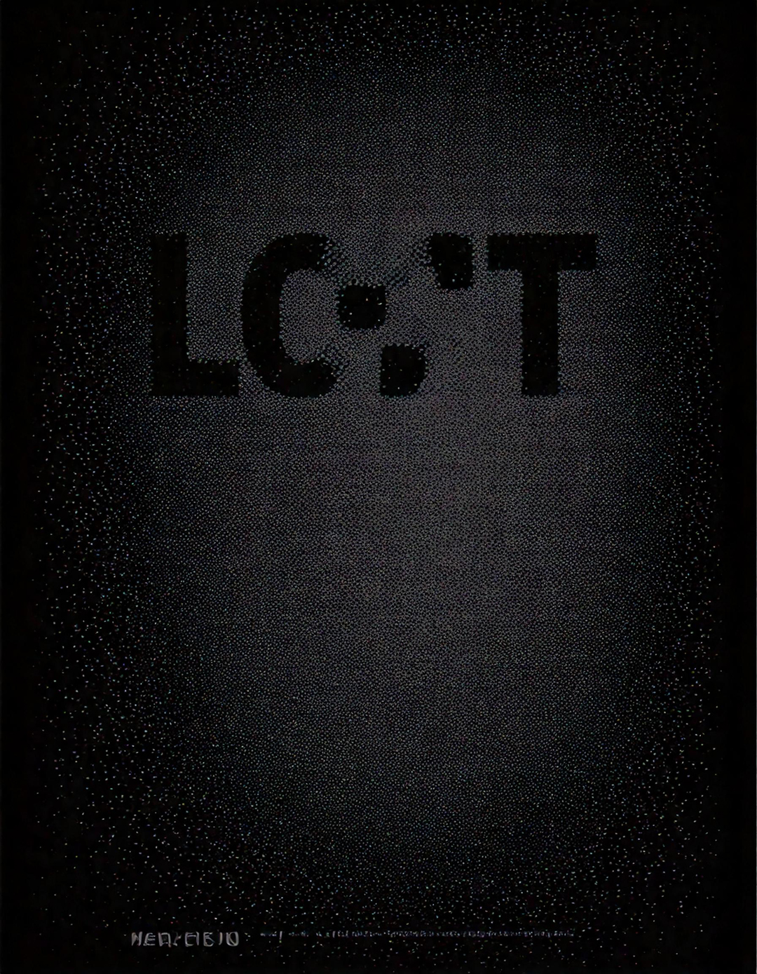
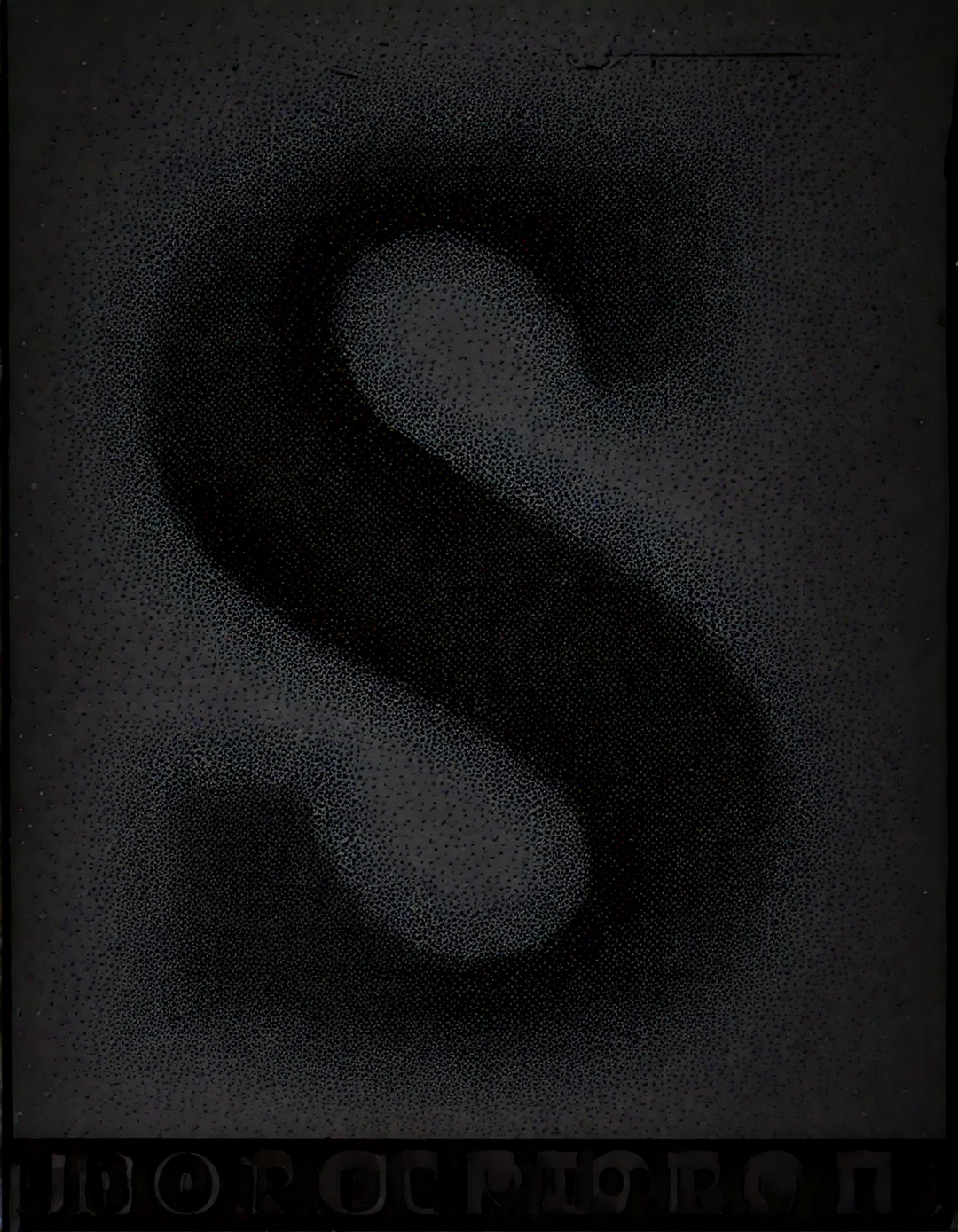
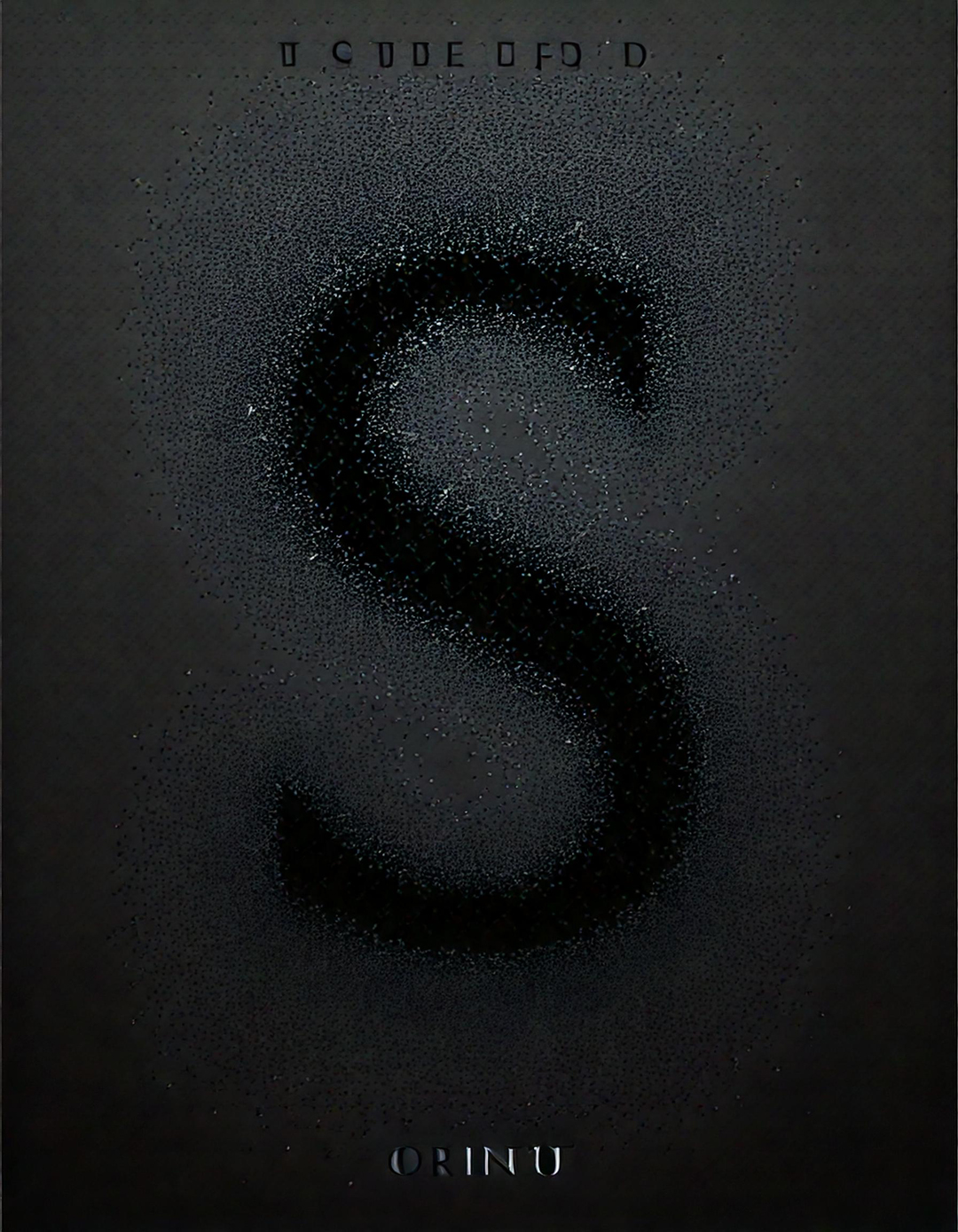
The first poster, titled "Losing," features black text that gradually fades and falls downward, accumulating at the bottom of the composition. This effect is enhanced by the dark gray paper it is printed on, reinforcing the sense of disappearance and loss. The second poster, titled "Finding," stands in stark contrast to the first. Here, the word "Finding" emerges from a scattered pile at the top, gradually forming into a structured word as it moves downward. The beige-colored text printed on cream paper adds to the feeling of rediscovery and emergence. This artwork explores the dynamic interplay of loss and discovery through the manipulation of typography and color.

Image to text description:
The word "Halcyon Days" is written in large letters on the left side of two designs, one light and the other dark. The background color for both images should be white or cream-colored. On each design, there will also be small text elements with various shades of gray to add depth and contrast. These designs have been created using vector graphics software such as Adobe Illustrator. This creative process has framed the words perfectly within their borders.
Minimalist design of the word "Haleiztecheri" on two different poster backgrounds, one in light beige and the other in dark black, with subtle grainy textures for an elegant touch. The font is modern yet bold, with each letter having its own unique texture to add depth and contrast between colors. This combination creates a visually striking composition that stands out against traditional typography styles.
The word "Ztracení" is written in large letters on the left side of two posters. One poster is white and beige with small particles on it, while the other poster has a black background. The text "z multiple" appears on the posters, which have a minimalistic design, simple lines, grainy texture, and a vintage aesthetic in a minimalist style, created by a graphic designer.
A minimalistic graphic design of the word "Ztrini Pharmaceuticals" on two different color backgrounds, one light beige and the other dark black, with a grainy texture.
LLM description:
"This dual-poster design presents the contrasting themes of "Finding" and "Losing," expressed through minimalist typography and transition effects.On the left side, the word "Finding" gradually lightens from bottom to top, evoking the process of visibility and clarity emerging. On the right side, the word "Losing" darkens downward, blending into a texture reminiscent of disintegration or fading away. The use of a sans-serif typeface gives the composition a stark and universal feel, allowing the transition effect to take center stage.The interplay of light contrast—light text on a light background versus dark text on a dark background—makes readability more challenging, requiring effort from the viewer. This reinforces the message of the posters: finding something often takes effort, just as recognizing that something is disappearing does.The restrained color palette enhances the impact and symbolism: beige and black tones support the idea of natural cycles, impermanence, and the flow of time. Overall, this is a sophisticated graphic treatment with a philosophical undertone." ChatGPT 4.0, OpenAI


Fading Away
Generated image in Adobe Firefly, using the original traditional poster as a reference for composition. Subsequently edited in Photoshop.
Electronic signature added in Adobe Illustrator. Font used: Helvetica.
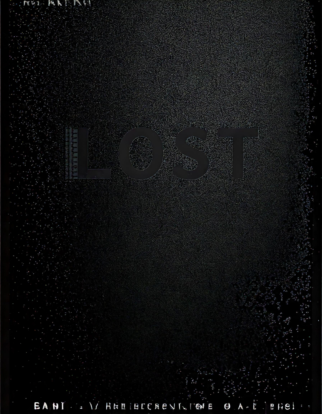
Collaborating with artificial intelligence in reworking my original poster was a challenge. AI often generated content incorrectly—the text appeared only in English, and everything was written in uppercase, as it struggled with lowercase letters. Despite all efforts, AI failed to produce a result that met my requirements. In the end, I had to manually adjust the output to achieve the desired quality and visual effect.

AI generated variations :

Galerie G18 ve Zlíně
Gallery of the Faculty of Multimedia Communications,
Tomas Bata University in Zlín
Štefánikova 5670, Zlín
Czech republic