mAI type: New possibilities in type design
One of the central themes of the mAI type exhibition is exploring how generative tools can transform the creation of type. By leveraging artificial intelligence, students investigated new possibilities in graphic design and experimented with processes that were until recently unimaginable. One such process is using natural language to generate visual content.
How can we generate individual letters or words? Can we generate entire sentences—or even a whole alphabet? How do we influence the minute details of a typeface? How do we control the outcome?
For the students, artificial intelligence became a partner in the design process—a co-pilot that streamlines ideation, exploration, and realization of ideas, as well as their modification or variation, yet still requires human oversight and creative intervention. Tools like text-to-image, image-to-image, and others allowed not only the production of visual outputs but also the transformation of traditional concepts into new contexts.
The exhibition showcases not only the results but also the students’ reflections on how AI affects the creative process. Each exhibit presents their perspectives and their ability to meaningfully connect traditional methods with rapidly evolving technologies. The project aimed to give students an opportunity to engage with generative tools and to open a dialogue between humans and machines.
This exhibition demonstrates that AI is not simply an assistant, but a new medium that expands the boundaries of the creative design process.
Authors: Students of the Graphic Design Studio at the Faculty of Multimedia Communications, Tomas Bata University in Zlín

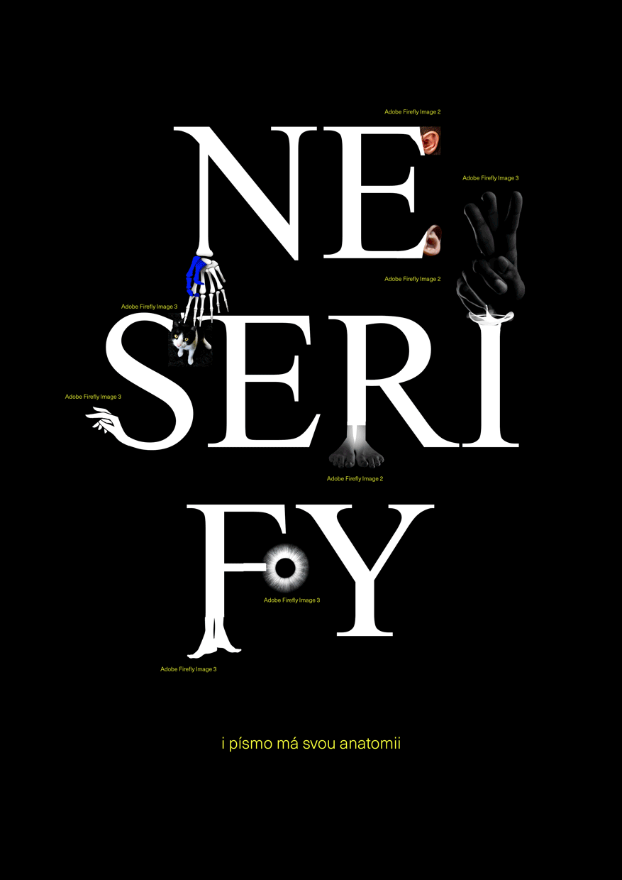
SERIFY / NESERIFY
Serifs are an inseparable part of the typeface known as antiqua. Along with the way each letter is shaded, they have a decisive influence on the typeface’s overall appearance. We observe how a given font designs them and note the specific shapes which, when repeated, form the character of the letters and thus the entire text. Among the vast number of fonts available, we can find serifs that are subtle or oversized, bold or thread-thin, regular or asymmetric, rounded or angular, gracefully tapering or abruptly attached to the letter body, discreetly sensitive or starkly minimalist, split, rounded, rectangular, square, and even triangular.

Galerie G18 ve Zlíně
Gallery of the Faculty of Multimedia Communications,
Tomas Bata University in Zlín
Štefánikova 5670, Zlín
Czech republic