SERIFY / NESERIFY
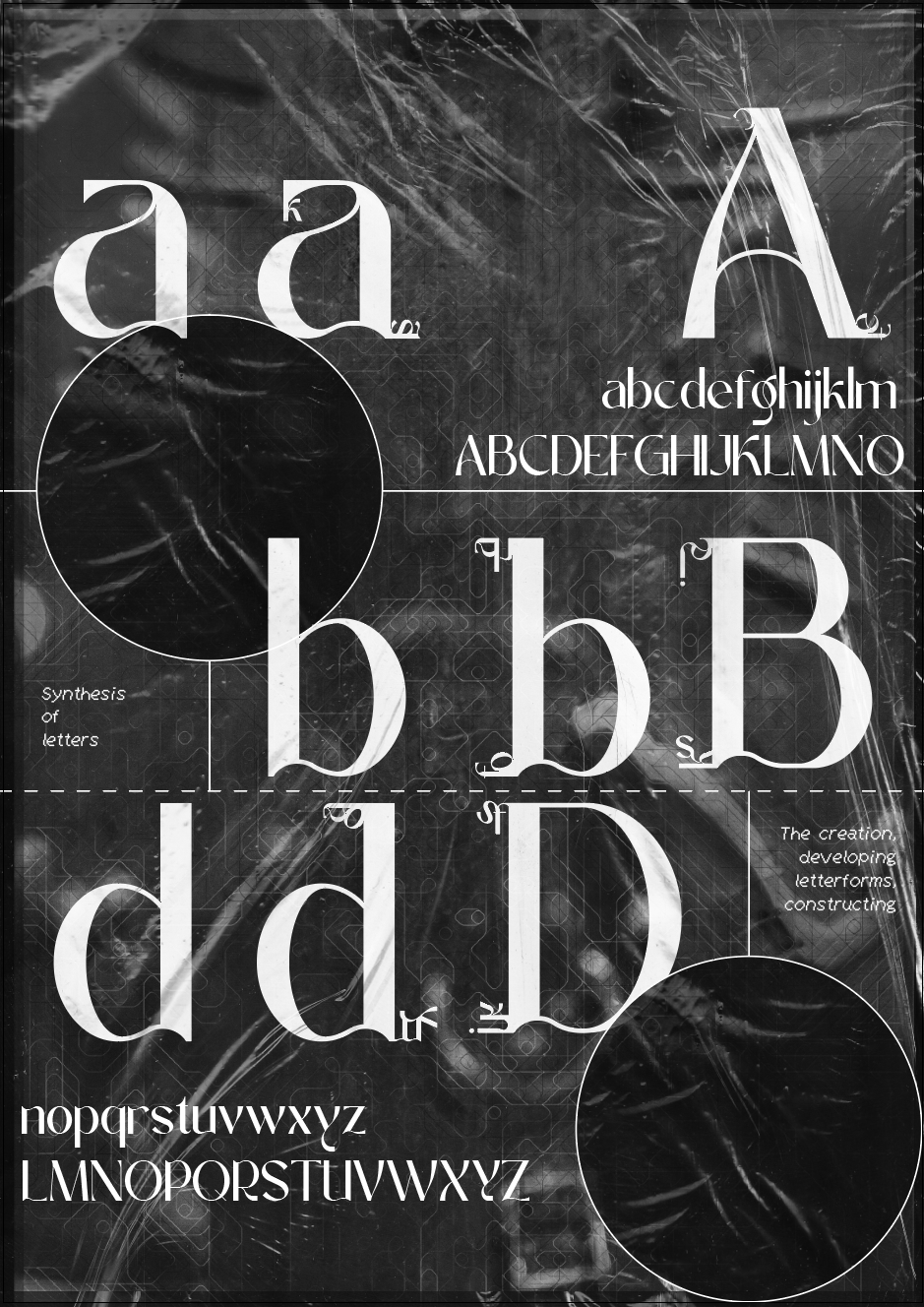
Serifs are an inseparable part of the typeface known as antiqua. Along with the shading of letters, they have a crucial impact on the visual appearance of a typeface.
We observe how serifs are designed within a specific font and take note of their individual shapes, which, through repetition, define the character of the letters and ultimately the entire text. Among the vast variety of fonts, we encounter serifs that are subtle or exaggerated, bold or thread-thin, regular or asymmetrical, rounded or angular, elegantly tapering or abruptly attached to the letter’s body, delicately refined or starkly minimalistic, split, rounded, rectangular, square, and even triangular.
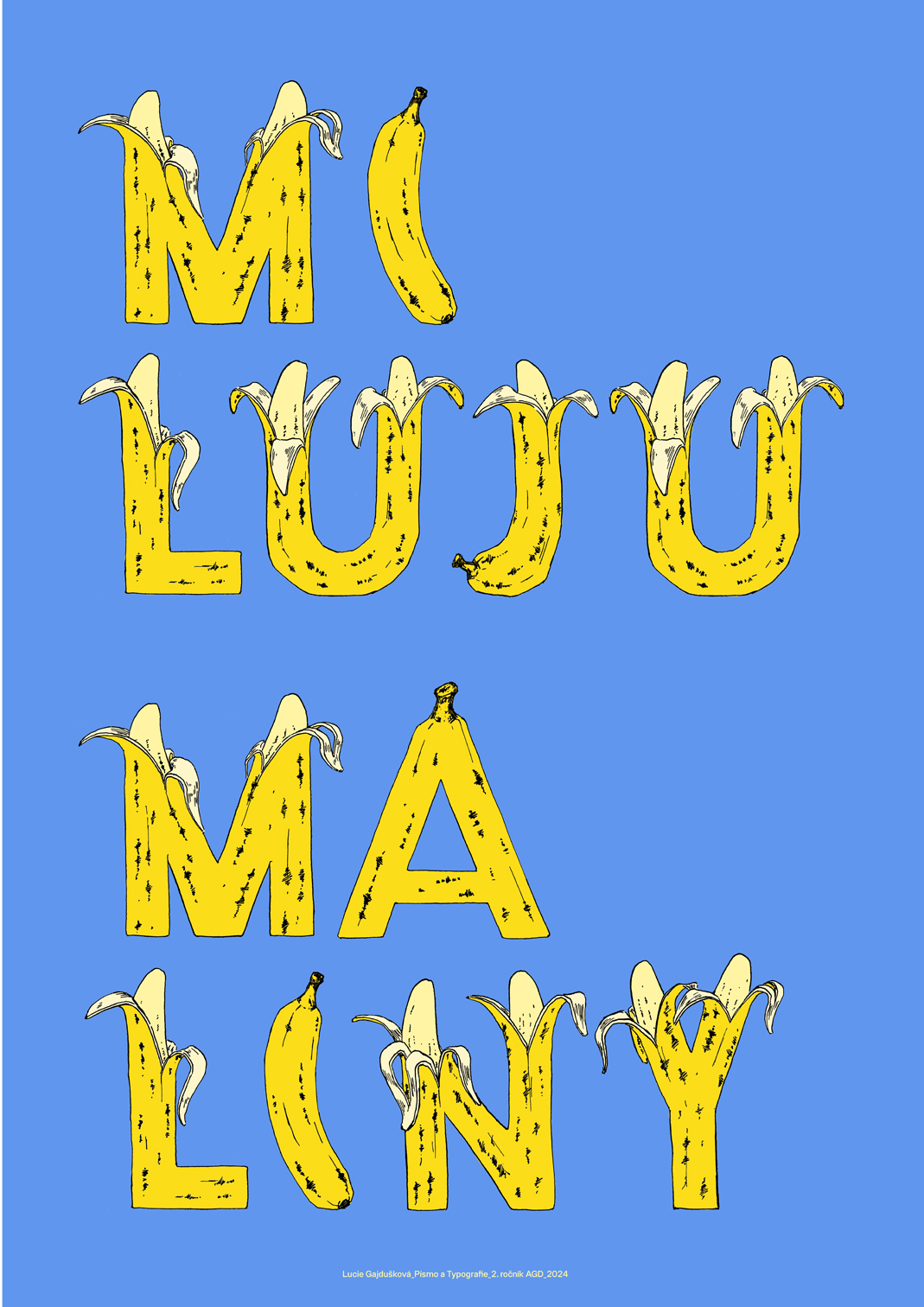
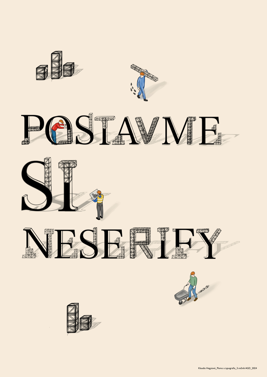
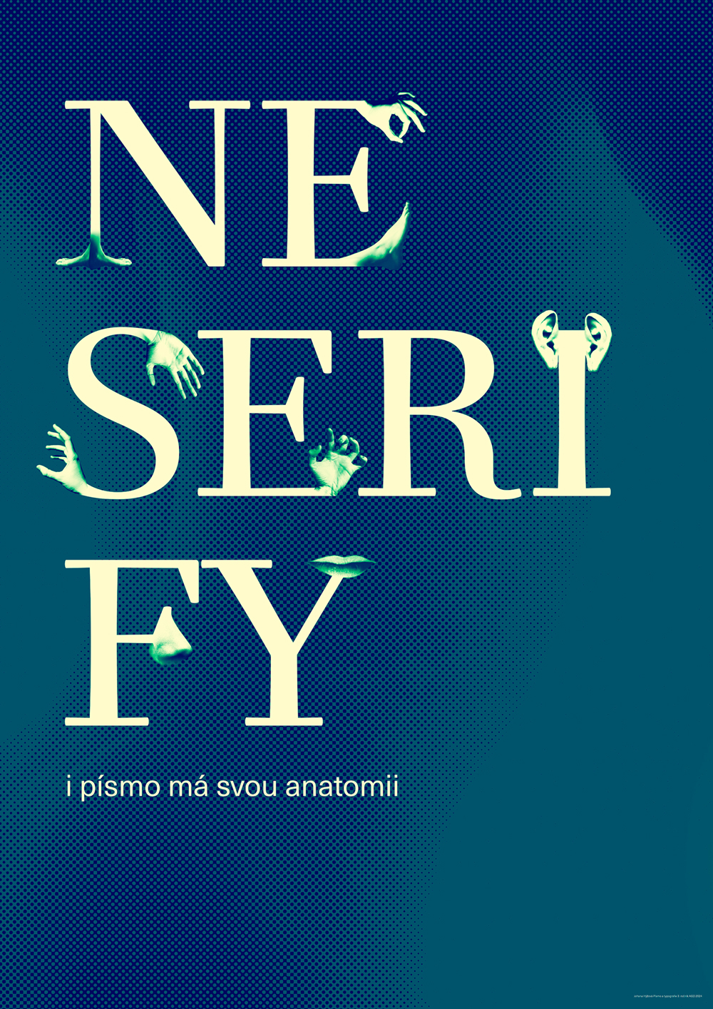
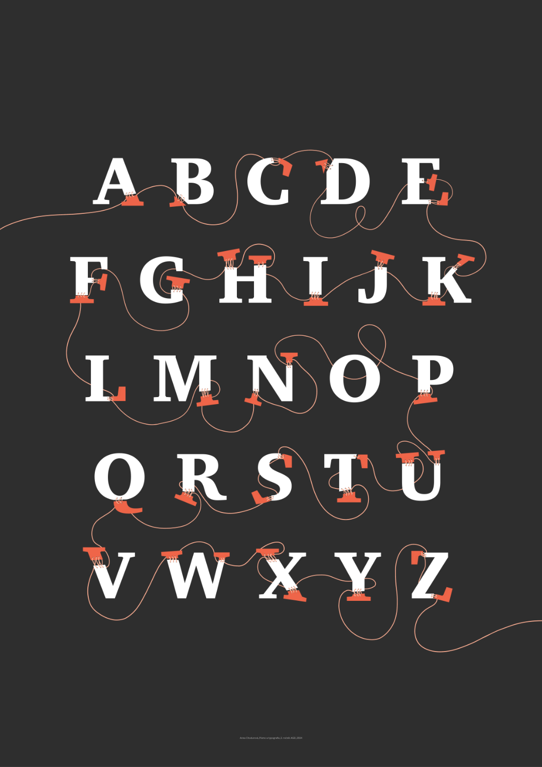
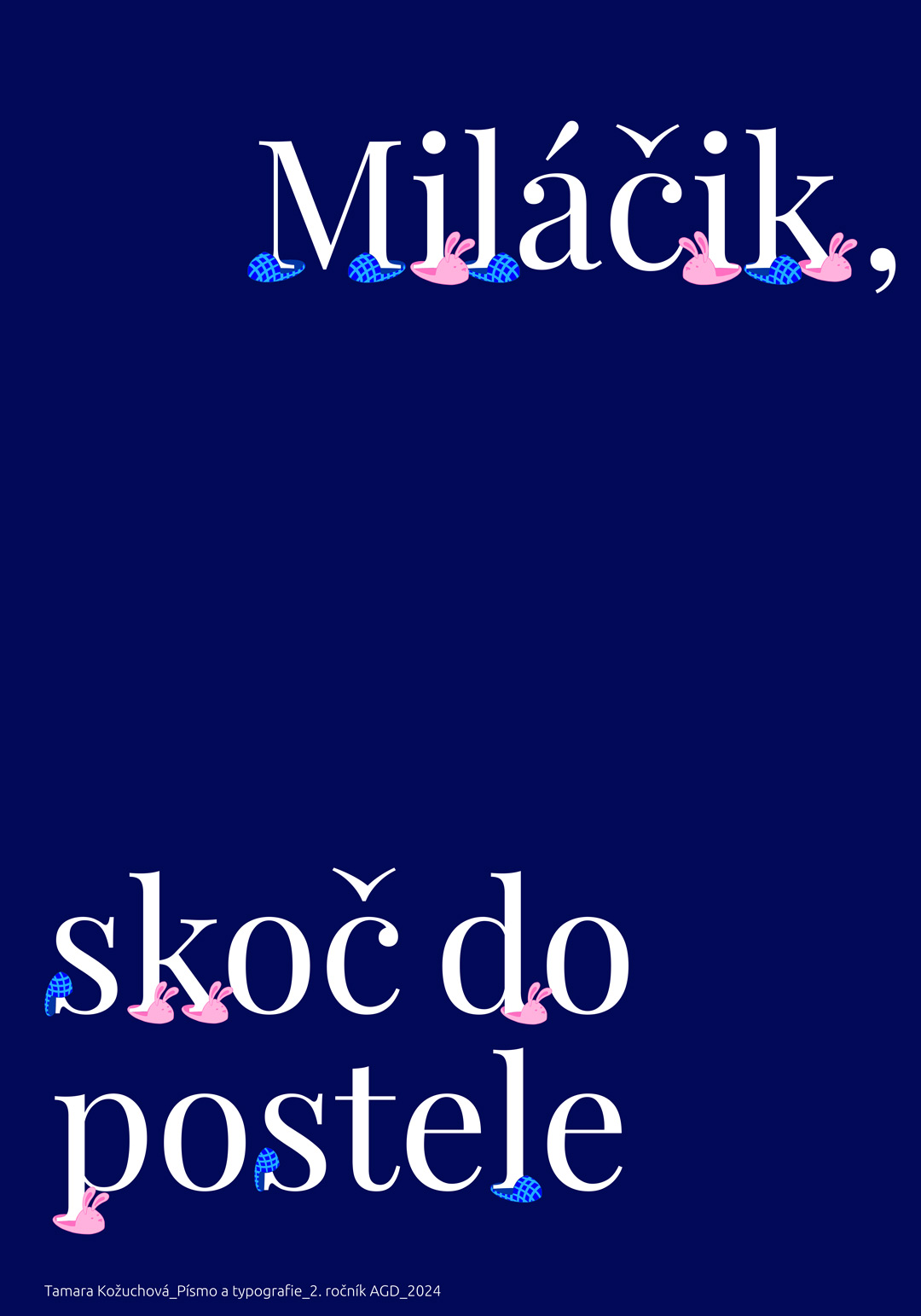
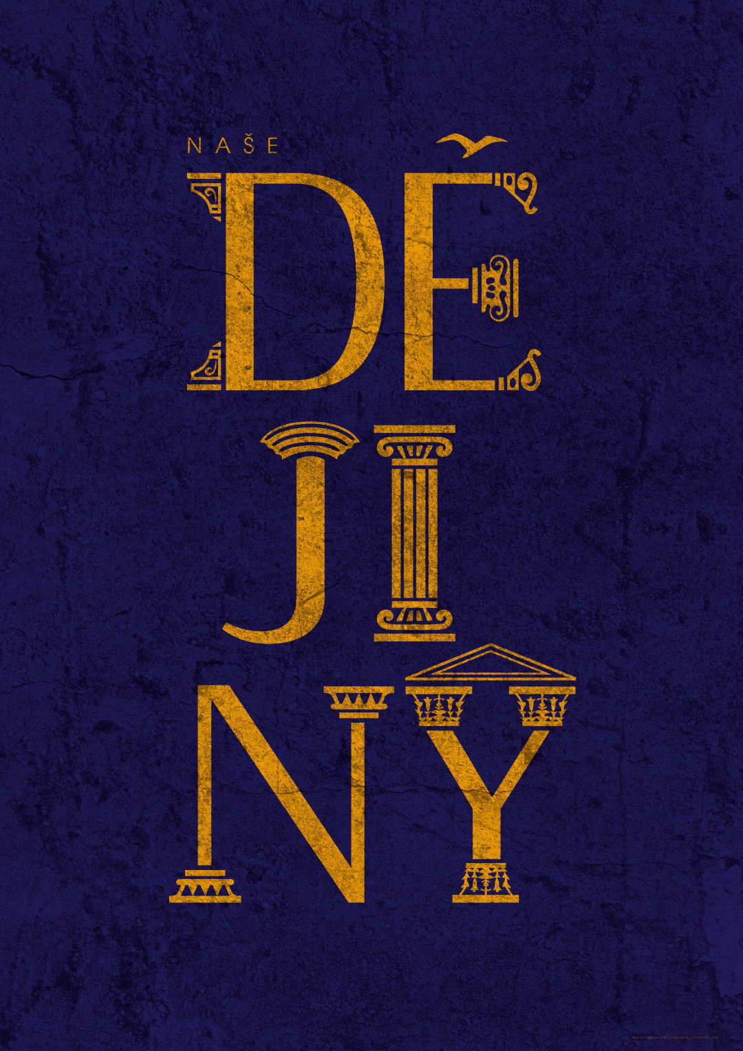
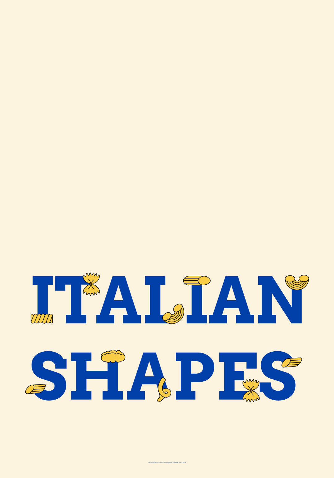
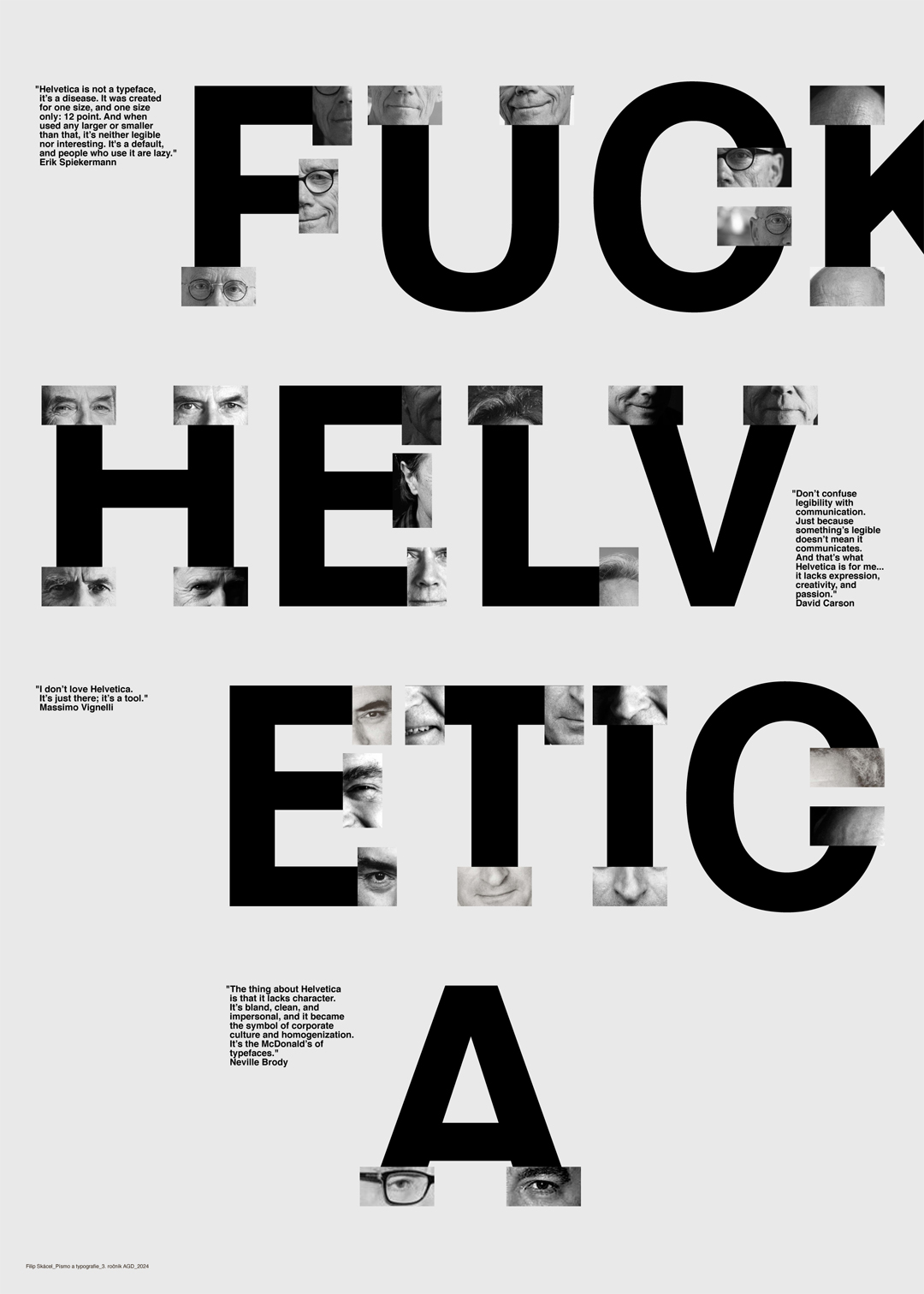
In our project, we explored what happens to an antiqua typeface when we digitally remove its existing serifs. The letters become unstable, vulnerable, their balance is disrupted, and they appear "naked." Alongside traditional serif and sans-serif fonts, we modified these altered forms by attaching our own serifs, designed freely according to our imagination. This resulted in unexpected and even bizarre combinations—letters fused with flowers, pasta, Roman column capitals, human body parts, and even pink slippers.
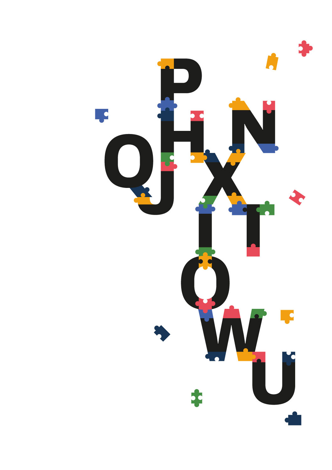
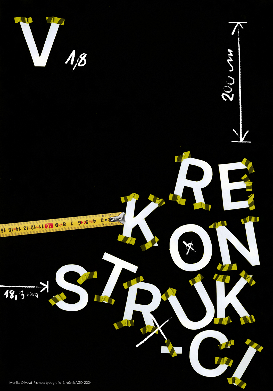
Another set of designs features serifs that crumble, swell, or detach, requiring them to be stitched back together. In this process, serifs were not always placed in their conventional locations (as dictated by typography rules). Instead, they appeared where we would least expect them—challenging norms and sparking creativity.
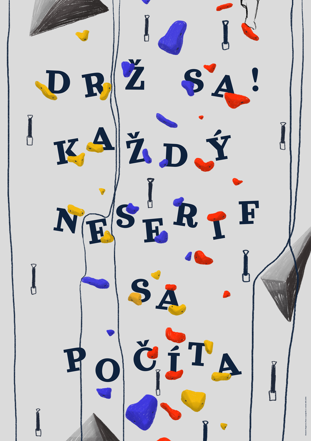
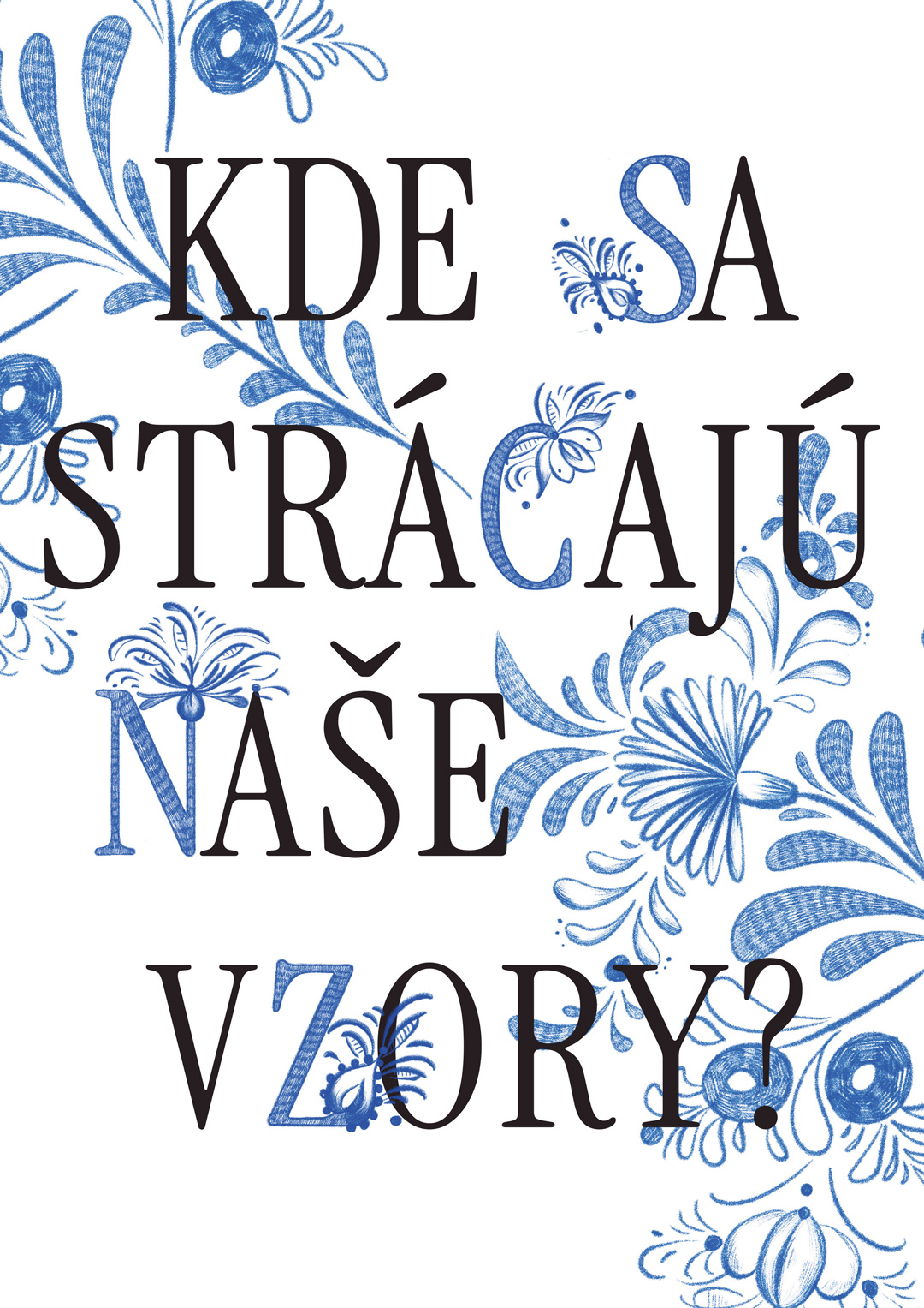
This exhibition aims to demonstrate that letters are not merely dry symbols we consume daily for reading and writing, often without much thought.
The creative exploration of the refined shapes of the Latin alphabet can become a playful artistic experiment—full of imagination, humor, and unexpected surprises.
Text by: M.A. Lenka Baroňová
The most beautiful work of God is the world, where all invisible divine things manifest themselves visibly. The most beautiful is our soul, which has been given the ability to reflect the world and all things within itself through thought. The most beautiful is speech, through which we imprint the images of our soul into the soul of another. The most beautiful is writing, by which we capture and permanently preserve speech—fleeting and ephemeral in its nature—holding it in place as if to make it endure…
J. A. Komenský, Opera didactica omnia
The works of students from the Graphic Design Studio, created as part of the Typography course and the NESERIFY project, represent a stage of outputs developed using both traditional and digital techniques:

The works created by students within the Neserify project served as a springboard for further experimentation with generative AI tools. The mAI type project provided students with the opportunity to connect traditional creative methods with modern technologies and explore new possibilities offered by generative artificial intelligence.

Galerie G18 ve Zlíně
Gallery of the Faculty of Multimedia Communications,
Tomas Bata University in Zlín
Štefánikova 5670, Zlín
Czech republic