Filip Skácel
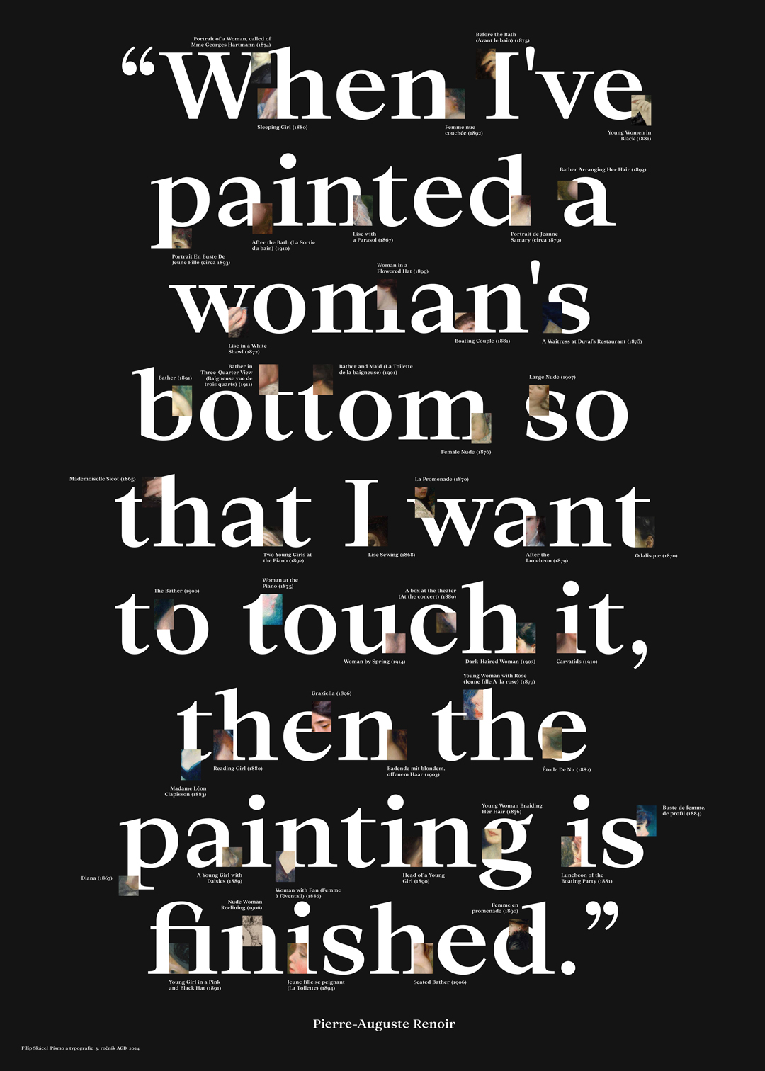
Master Renoir, what do you think of today’s art?
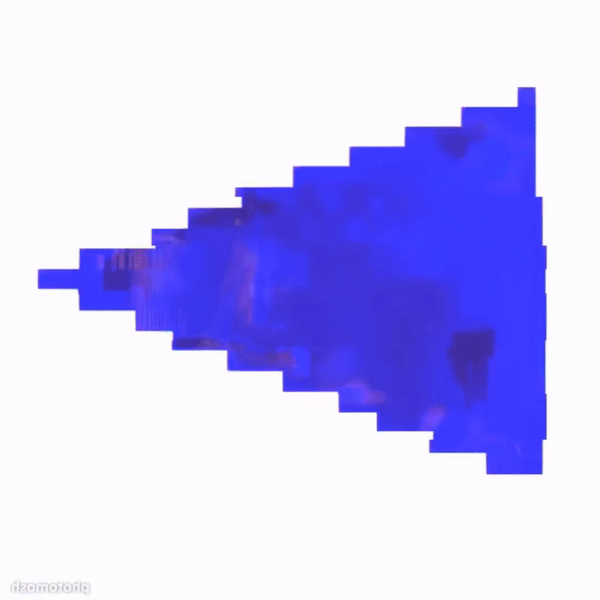
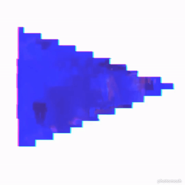
Digital collage of visual fragments generated using OpenAI’s DALL-E model.
The prompts are generated based on Renoir's paintings using the CoCoClip.ai app.
These fragments are then composed in Adobe Illustrator on the Ortica typeface from the Collletttivo foundry.
The resulting generations are animated using Vivago.ai, and with Adobe After Effects, they are replaced with the original.
The creative process is often a tricky matter, and as creators, we sometimes don’t know when to stop, when the work is finished. However, it is this indecisiveness or the infinity of the work that can distinguish the human experience from others. The eternal romantic Auguste Renoir, in his lesser-known quote, confesses that he considers a painting finished only when he wants to touch the painted woman’s hips. It’s a primal, yet transcendent moment, when the artist, the creator, comes into contact with the subject and its reinterpretation in real time. He can touch the object, just as he can touch the painting itself.
This stands in stark contrast to the modern approach of implementing artificial intelligence, specifically generative visual models. Renoir himself, in another lesser-known quote, foreshadows today when he says that we live in a time of discovery rather than creativity. Searching for the right phrases for input prompts to generate images sometimes feels like wandering through an endless forest or having a garden tea party. Today’s creative process, however, is also different. There is a feeling as though everything has already been said, all books written, and all paintings painted. It’s a time of recycling and redesigning what’s been experienced, yet it is also something without which we wouldn’t be here, so giving homage is necessary.
At the same time, it sounds as though generative models were already being utilized in the late 19th and early 20th centuries, and this forces us to reflect on where today’s artist and designer can go, and where technological development will take us, when Master Renoir describes the past as the present.

Image to text description:
The quote "We are in a period of seekers, not merely ranch-hand creators" is written on the poster with white letters against a black background. In between these words, there's an illustration made from small images of people who create art. The style should be modern and minimalistic. Use light colors for the text and illustrations to make them stand out against the dark background. This design would appeal to those around their thirties who enjoy creative work or personal branding.
The quote "We are in a period of search rather than answers" is displayed above the poster typography, which features a black background, white text, and white letters, with images of people searching for and sharing content on social media platforms. The design is minimalist yet impactful, showcasing modern digital marketing trends. The poster is incredibly detailed, with intricate details, professional photography lighting, professional color grading, clean sharp focus, and a hyperrealistic appearance.
The words "We are in a period of searching, not compartmentalized" in the style of Auguste Rodin on a black background with white text. The style is modern and minimalist, featuring a large font that stands out against the dark backdrop. There's an emphasis on clarity and simplicity to make each word stand tall and distinct. In between these words, there are images of people searching or studying different things like art, technology, and science, creating a sense of diversity within one theme.
A typographic poster with the phrase "We are in a period of searching, not featuring an abstract or conceptual design style." The text is arranged to create visual elements that resemble images and icons representing searching people, all set against a dark background. There's white space around each letter to emphasize their importance on the screen print, and a subtle texture-like effect adds depth to the overall composition. In the style of Pierre Adams-Redman, 3D typography.
LLM description:
"This image combines the quote by Pierre-Auguste Renoir “We are in a period of searchers rather than of creators” with typography and visual design that reinforces its message. The chosen font features robust, square serifs, evoking strength and traditional values. The large size of the text dominates the dark background, with the white lettering ensuring strong contrast and high readability. An interesting element is the inclusion of small text passages and illustrations integrated within the larger letters—visually symbolizing the process of searching and discovering in an artistic or creative context. The background, with its textures and visual fragments, hints that the age of "searchers" is filled with analysis and drawing inspiration from the past. The overall composition works with minimalism and contrast, placing emphasis on the key idea of the quote." ChatGPT 4.0, OpenAI
"Creating this synthesis felt like sewing an old coat with new threads from the future. The generative models showed potential for building a new world, but those ambitions often quickly faded when one had to fine-tune the input prompt multiple times just to get something usable. Renoir’s original models changed their nationality, their clothing, and transformed into something that can no longer be called ‘old’, nor directly ‘new’, unless the result blindly follows the infinite prompts of the past and steals from the infinite works of the past."
Project 2
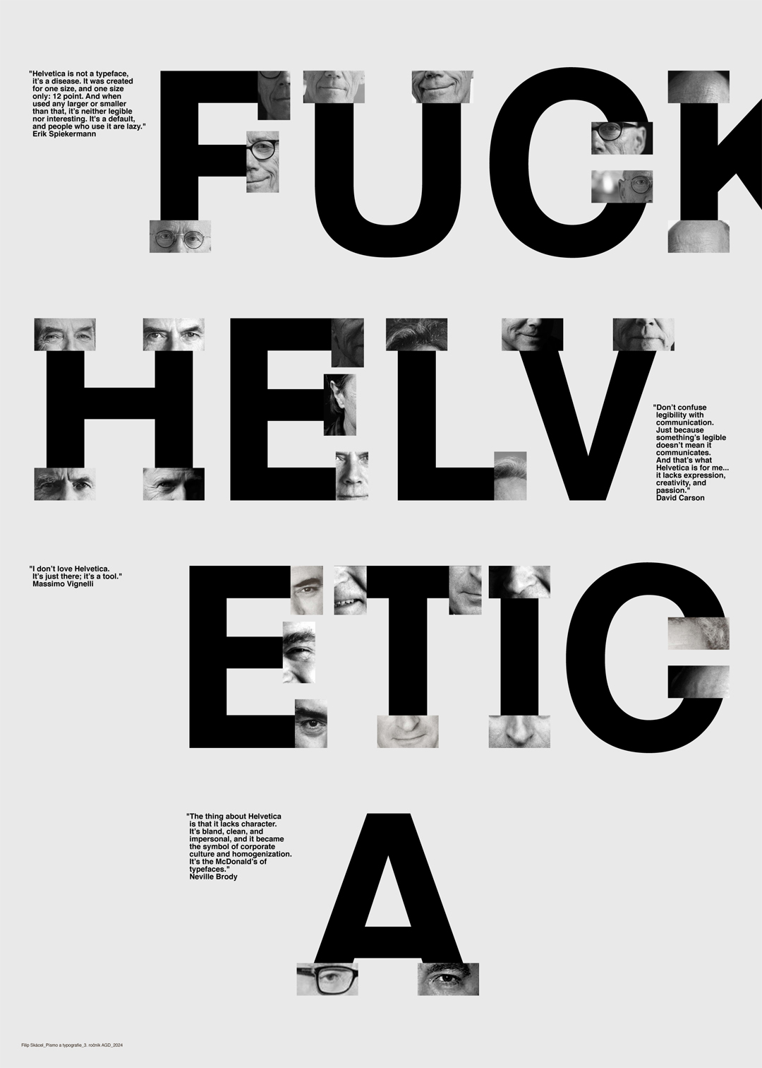
F*ck Helvetica
Digital collage of fragments of portraits of famous typographers, composed in Adobe Illustrator on the Helvetica typeface.
The portraits are then animated using Vivago.ai, and with the help of Adobe After Effects, they are replaced with the original.
A typeface that is both loved and hated, like an unusual ingredient in food. For its time, Helvetica was a purely rational and functional thing, serving its purpose perfectly. The typeface became a synonym not only for graphic design but also for almost any form of printed material. However, there were those who disdained it, and today, they see it as a relic or imperfection, which is easier to critique in today’s digital world. The most common criticism is allegedly its low legibility and lack of character. But what if it is exactly these traits that give the typeface its uniqueness? What if, especially in today’s time, for which Helvetica is already too little, these smart minds project their ideas onto it? What if this is what makes Helvetica more legible, almost serif-like, as these prophets set their boundaries on how not to work with this typeface, and yet, also, how to work with it?
Image to text description:
The poster has bold text in black and white that reads "FRACTICAL". The letters have different sans-serif fonts, each letter is arranged to create an illusion of faces or eyes within the typography. There's also some typeface with other shapes like circles and squares. The background color is plain white. In the top left corner, there's a small logo of face-like figures made from typographic elements.
The poster is made of black and white letters with the words "FORBIDDEN HELVETICA" arranged in large, bold sans-serif typography. The text stands out against a stark background that creates an atmosphere of simplicity and clarity. There's also some smaller imagery such as faces or shapes inside each letter to add visual interest and depth. in the style of John Holcroft for Sagi Haviv Minimalist design style, flat vector illustration style, simple lines, pure minimalism, white background.
Black and white typographic poster with the text "Futura Luger Helvetica Light" in bold sans-serif letters on an off-white background. The phrase "A precise emblem in black and to the left - in the style of Valerie Hartig", the top two lines of which also spell out the phrase 'Stinking third eye'. There are some photographic elements such as small square cutouts that can be used to add depth or texture, and it has been designed with typography-inspired graphics.
A typographic poster with the text "Funderation-Eyediegesia" in bold black letters on a white background, each letter is made of different images and shapes, arranged to form an eye shape. The eyes have various expressions, such as happiness or sadness, and the overall design conveys creativity and imagination. The style draws inspiration from the work of graphic designer Jan Tegnér.
LLM description:
"This image combines typography and photography to provoke a debate about the use of Helvetica, one of the most iconic sans-serif typefaces. Helvetica, known for its simplicity and geometric balance, is shown in large bold letters, with cutouts of faces in the letters symbolically linking the typeface to the opinions of influential figures such as Erik Spiekermann, David Carson, and Neville Brody. The text in the image critiques Helvetica as a uniform and “characterless” tool of corporate design, often seen as a choice made out of convenience. It also draws attention to the difference between legibility and communication, thereby questioning the universal use of this typeface. The image raises questions about aesthetics and function in typography, while prompting reflection on alternatives and creative approaches to design." ChatGPT 4.0, OpenAI
A typeface that is both loved and hated, like an unusual ingredient in food. For its time, Helvetica was a purely rational and functional design, serving its purpose excellently. The typeface became a synonym not just for graphic design, but for almost any printed material. Yet, there have always been those who disdain it, and today, they see it as a relic or imperfection, more easily critiqued in the digital world. The most common complaint is allegedly its low legibility and lack of character.
But what if it’s precisely those traits that give the typeface its uniqueness? What if, especially in today’s world, for which Helvetica has become insufficient, these smart minds project their ideas onto it? What if this is exactly what makes it more legible, even serif-like, as these prophets set their boundaries on how not to work with this typeface, and, in fact, how to work with it?

Galerie G18 ve Zlíně
Gallery of the Faculty of Multimedia Communications,
Tomas Bata University in Zlín
Štefánikova 5670, Zlín
Czech republic